Olha ‘Ola’ Lytovchenko

Home
About
Contact
Research / Design
Nobody But You
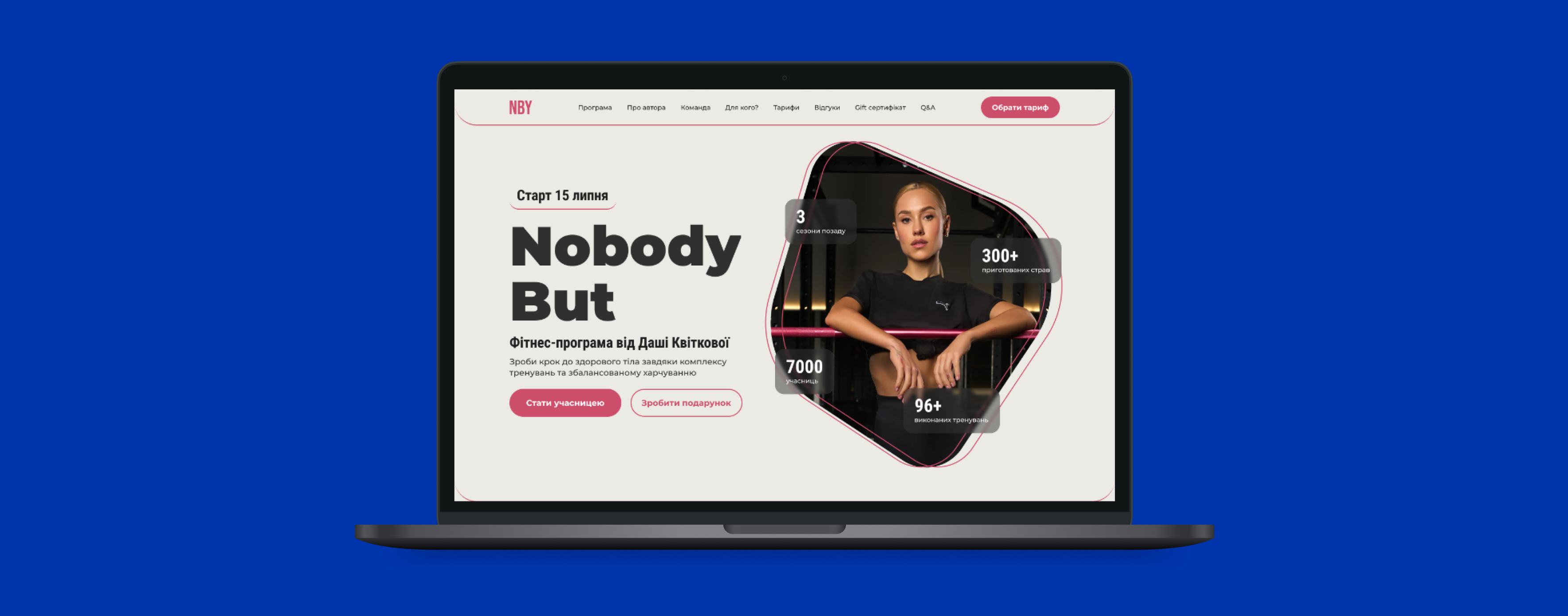
Workouts that work. A redesigned digital experience for a raining program—making it easier to access, follow, and stay motivated with structured workouts built for real life.
Project Overview
This project involved redesigning the website for a sports training program in Ukraine to improve usability, accessibility, and engagement. The existing website had navigation challenges, unclear course details, and a complicated enrollment process, leading to user frustration. The redesign focused on creating a more intuitive user experience by simplifying navigation, enhancing content clarity, and streamlining the sign-up process. By implementing a user-centered design approach, the new website provides a seamless and engaging experience tailored to the needs of busy women aged 25-40, making it easier for them to explore training options and enroll effortlessly.
Design Approach
Research
Extensive research was conducted, including user interviews, competitive analysis, and heuristic evaluations, to gather insights about user pain points, goals, and behaviors.
Synthesis
Insights were synthesized into clear problem statements, personas, and user journey maps to guide the design process and ensure alignment with user needs.
Design
Ideas were brainstormed and transformed into wireframes and prototypes, focusing on creating intuitive and accessible solutions to identified problems.
Delivery
The prototypes underwent usability testing in multiple rounds to gather feedback and refine the design, ensuring the final product was effective, seamless, and aligned with user expectations.
Scope of Work
- The Sports Training Program Website Redesign aims to improve user experience by enhancing navigation, content clarity, and the enrollment process. The current challenges include a lack of intuitive structure, unclear course details, and a complex sign-up flow, leading to user frustration.
- To address these issues, the redesign will focus on simplifying navigation, making course information more accessible, and streamlining the enrollment journey for a seamless experience.
- This will be achieved through UX research, wireframing, prototyping, and usability testing to ensure an intuitive and engaging platform tailored to the needs of busy women aged 25-40.
Research & Synthesis
Goal of Research
The research aimed to identify key usability issues and opportunities for improvement in the existing website. By analyzing competitors, conducting usability testing, and performing a heuristic evaluation, the goal was to uncover pain points related to navigation, content clarity, and the enrollment process to create a more intuitive and engaging user experience.
- Usability Testing+Interviews
- Comparative Research (SWOT Analysis)
- Heuristic Evaluation
Methodology
Usability Testing + Interviews
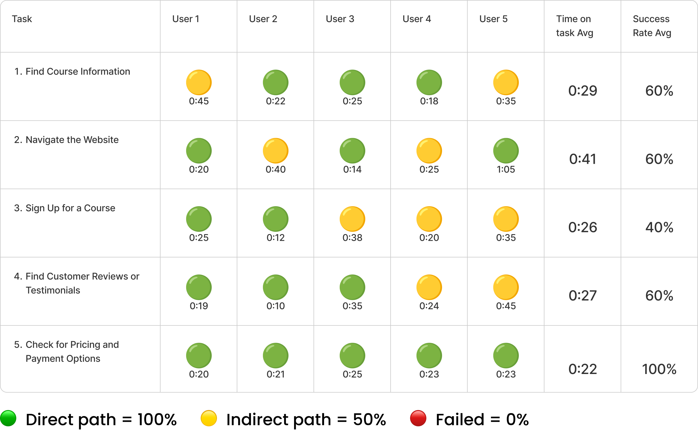
- While most users could find course details, some took noticeably longer, indicating that the content structure or navigation may need adjustments.
- Users generally navigated the website with ease, though a few encountered minor challenges, suggesting room for refinement.
- Signing up for a course proved to be one of the more difficult tasks, with inconsistencies in completion time and success rates. This suggests that the process may be too complex or unclear.
- While users were able to locate testimonials, some struggled to find them quickly, indicating that they may not be as prominent as they should be.
- Users had no trouble locating pricing details, showing that this section is well-structured and effectively communicated.
Key Takeaways:
Persona
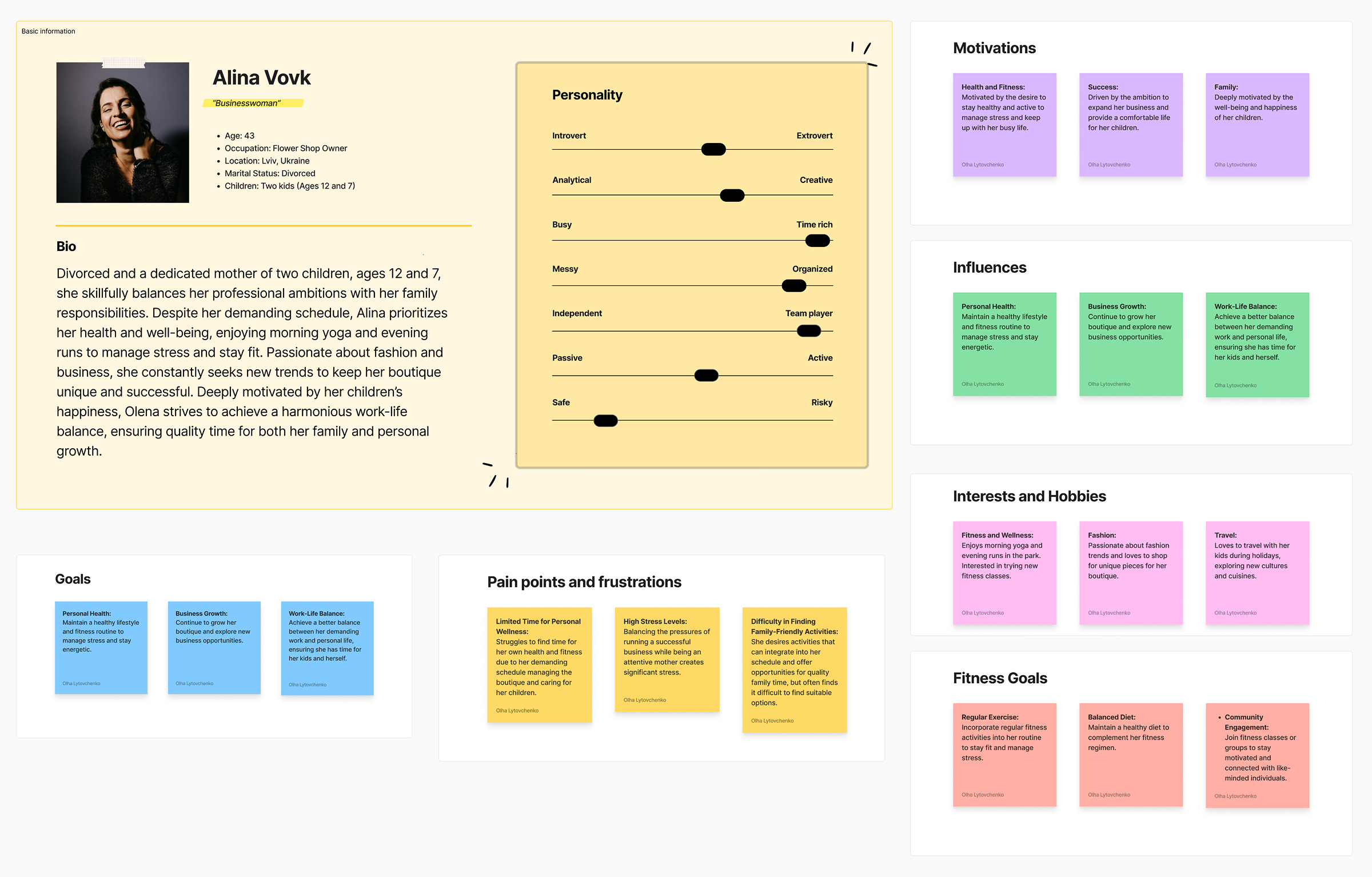
Insights gathered from user interviews provide a deep understanding of user needs, preferences, and challenges, shaping the design and functionality of this section.
C&C Analysis
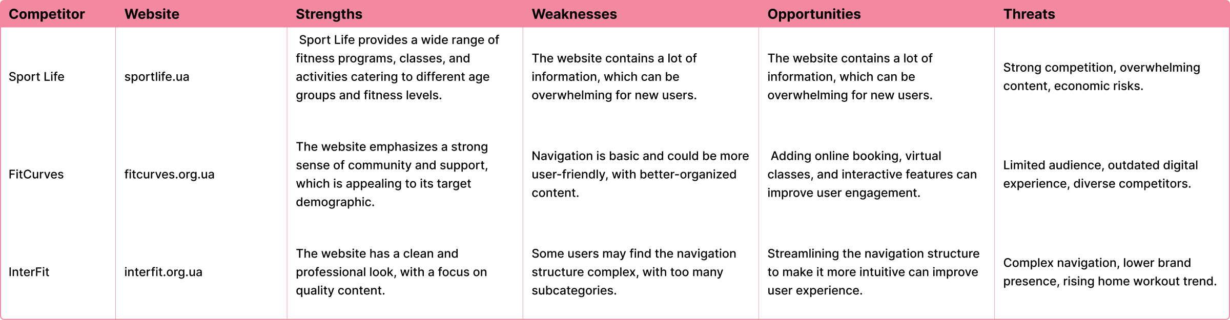
SWOT Analysis
Heuristic Evaluation
Insights gathered from user interviews provide a deep understanding of user needs, preferences, and challenges, shaping the design and functionality of this section.
- Visibility of System Status
The site provides clear navigation and interactive elements, but feedback on user actions could be more pronounced.
- Match Between System and the Real World
Uses familiar fitness-related terminology, but some sections have long blocks of text that may overwhelm users.
- User Control and Freedom
No clear way to undo actions or navigate back easily from certain sections. A breadcrumb trail or back buttons could improve usability.
- Consistency and Standards
The design maintains a consistent style, but some elements (e.g., CTA buttons) could be more uniform in placement and appearance.
- Error Prevention
Limited interactive forms reduce error potential, but unclear pricing differentiation may cause confusion.
- Recognition Rather Than Recall
Key information is visible, but users might struggle to compare pricing tiers quickly. A more scannable layout would help.
- Flexibility and Efficiency of Use
The site caters to first-time visitors well, but returning users might benefit from quick access to their preferred section.
- Aesthetic and Minimalist Design
Strong visuals and a modern look, but heavy text sections could be streamlined for readability.
- Help Users Recognize, Diagnose, and Recover From Errors
No visible error messages or guidance for potential issues.
- Help and Documentation
FAQ section is helpful, but additional tooltips or a chatbot for quick answers could enhance the experience.
Areas of Improvement
- Improve feedback on user interactions like hover effects and button states.
- Make pricing and participation options more scannable.
- Reduce text-heavy sections for better readability.
- Add navigation aids like breadcrumbs for better user control.
Key Takeaways
Community Driven
Emphasize building a strong community tailored to Ukrainian users.
Clear Pricing
Provide transparent and simple pricing to attract and retain users.
Improved Visuals
Design a visually engaging and user-friendly website to boost user engagement and retention.
Design & Delivery
Sketching + Concepting
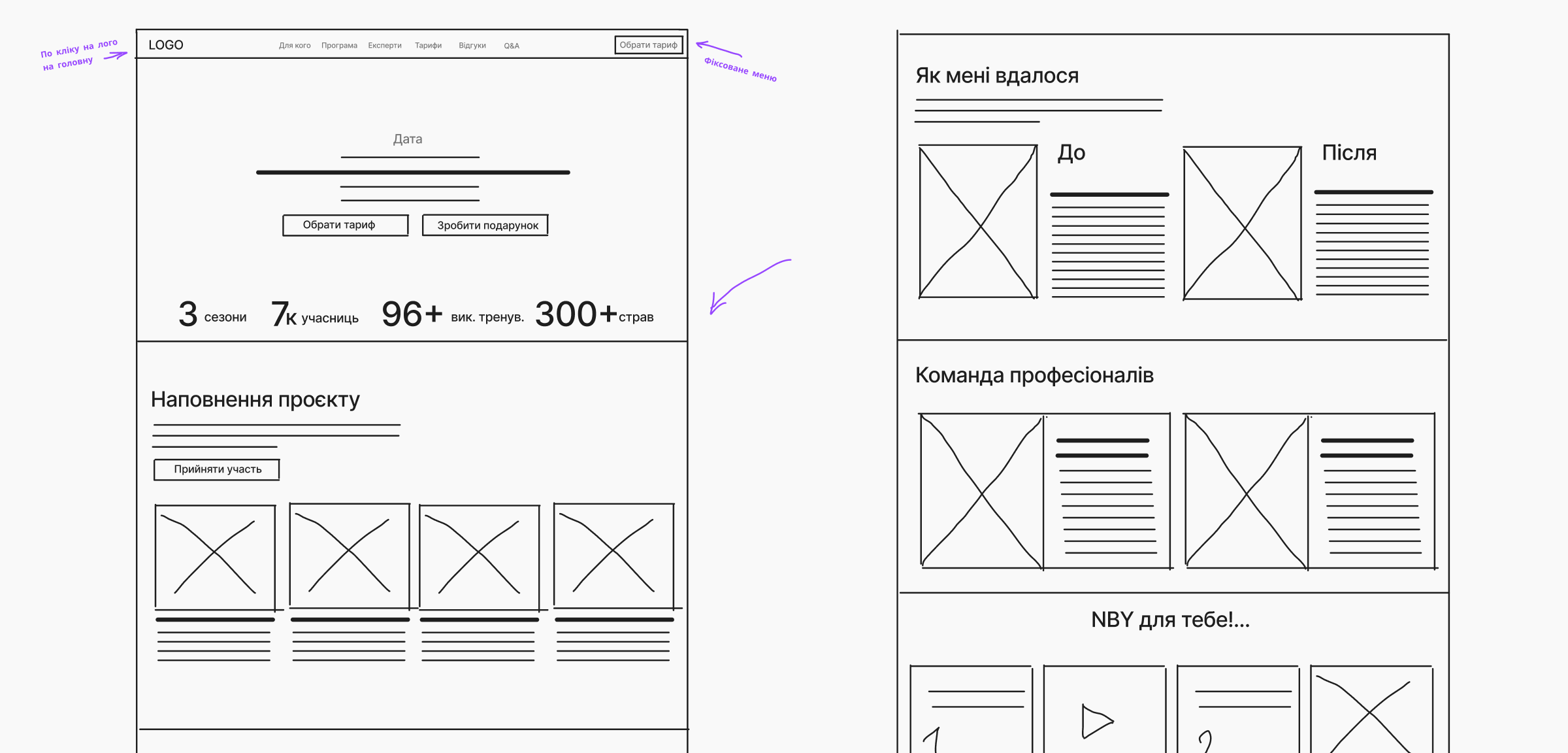
Mid-fidelity Screens
The mid-fidelity designs translate initial sketches into structured wireframes, refining layout, hierarchy, and functionality while ensuring a clear user flow before moving into high-fidelity visuals.
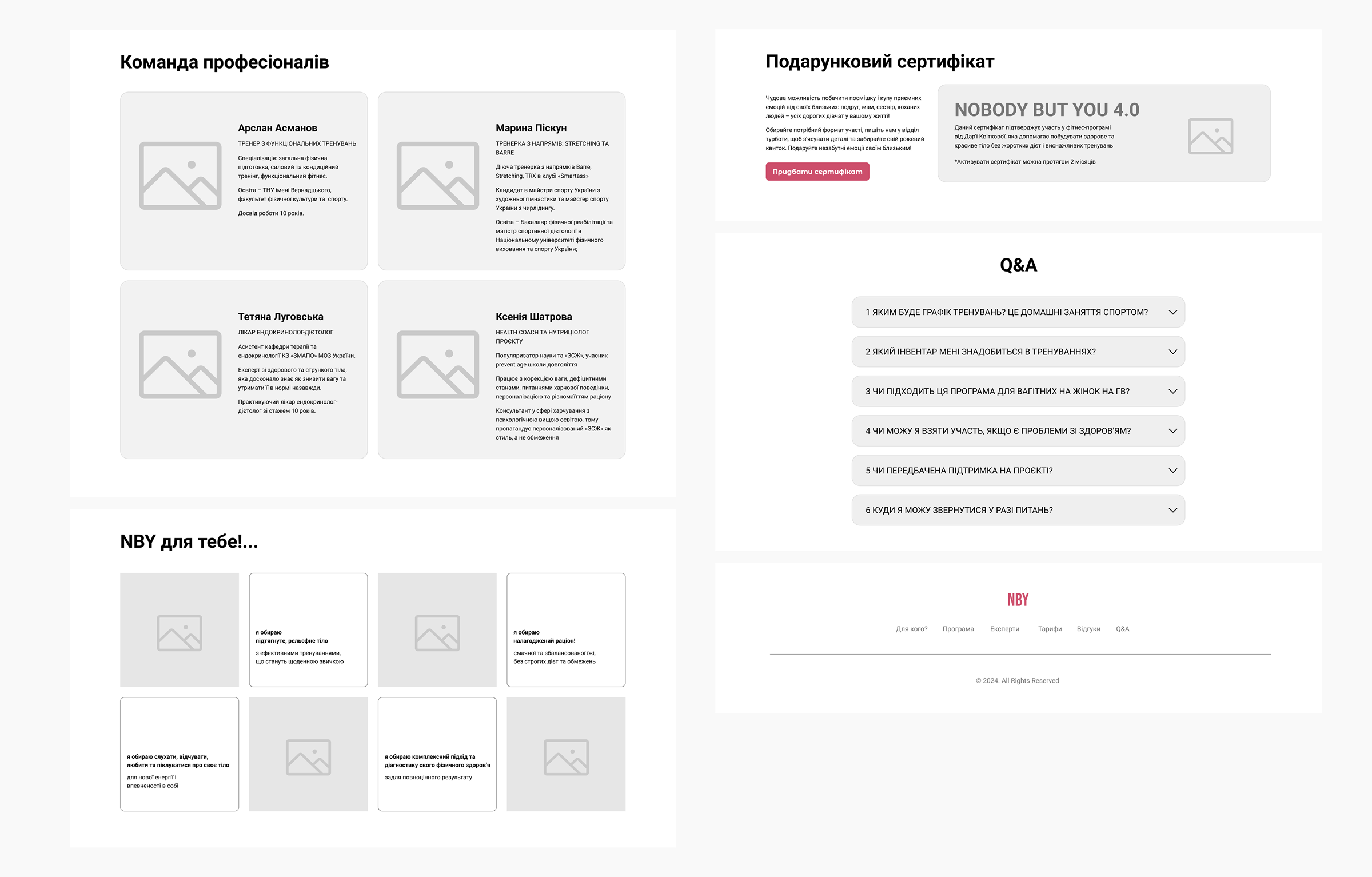
Hi-fidelity Screens
The high-fidelity designs build upon the mid-fidelity wireframes, incorporating final visuals, branding, and interactive elements to create a polished, user-ready interface.
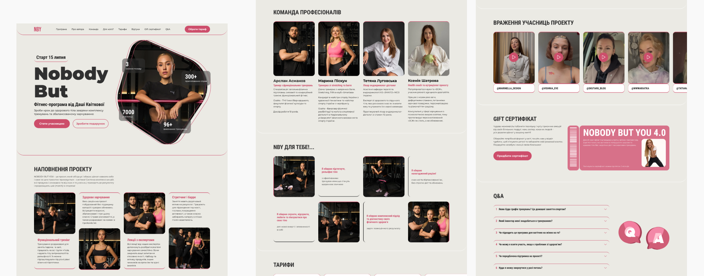
Prototype
Olha ‘Ola’ Lytovchenko
Home
About
Contact
Research / Design
Nobody But You
Workouts that work. A redesigned digital experience for a raining program—making it easier to access, follow, and stay motivated with structured workouts built for real life.
Project Overview
This project involved redesigning the website for a sports training program in Ukraine to improve usability, accessibility, and engagement. The existing website had navigation challenges, unclear course details, and a complicated enrollment process, leading to user frustration. The redesign focused on creating a more intuitive user experience by simplifying navigation, enhancing content clarity, and streamlining the sign-up process. By implementing a user-centered design approach, the new website provides a seamless and engaging experience tailored to the needs of busy women aged 25-40, making it easier for them to explore training options and enroll effortlessly.
Design Approach
Research
Conducted SWOT analysis, usability testing, and heuristic evaluation to identify navigation issues, unclear course details, and a complex enrollment process.
Synthesis
Analyzed findings to define key pain points and opportunities, focusing on simplifying navigation, improving content clarity, and streamlining enrollment.
Design
Created wireframes and prototypes with an intuitive layout, clear course details, and a seamless sign-up flow to enhance user experience.
Delivery
Refined high-fidelity designs through testing and feedback, ensuring a user-friendly and engaging platform.
Scope of Work
- The Sports Training Program Website Redesign aims to improve user experience by enhancing navigation, content clarity, and the enrollment process. The current challenges include a lack of intuitive structure, unclear course details, and a complex sign-up flow, leading to user frustration.
- To address these issues, the redesign will focus on simplifying navigation, making course information more accessible, and streamlining the enrollment journey for a seamless experience.
- This will be achieved through UX research, wireframing, prototyping, and usability testing to ensure an intuitive and engaging platform tailored to the needs of busy women aged 25-40.
Research & Synthesis
Goal of Research
The research aimed to identify key usability issues and opportunities for improvement in the existing website. By analyzing competitors, conducting usability testing, and performing a heuristic evaluation, the goal was to uncover pain points related to navigation, content clarity, and the enrollment process to create a more intuitive and engaging user experience.
- Usability Testing+Interviews
- Comparative Research (SWOT Analysis)
- Heuristic Evaluation
Methodology
Usability Testing + Interviews
- While most users could find course details, some took noticeably longer, indicating that the content structure or navigation may need adjustments.
- Users generally navigated the website with ease, though a few encountered minor challenges, suggesting room for refinement.
- Signing up for a course proved to be one of the more difficult tasks, with inconsistencies in completion time and success rates. This suggests that the process may be too complex or unclear.
- While users were able to locate testimonials, some struggled to find them quickly, indicating that they may not be as prominent as they should be.
- Users had no trouble locating pricing details, showing that this section is well-structured and effectively communicated.
Key Takeaways:
Persona
Insights gathered from user interviews provide a deep understanding of user needs, preferences, and challenges, shaping the design and functionality of this section.
C&C Analysis
SWOT Analysis
Heuristic Evaluation
Insights gathered from user interviews provide a deep understanding of user needs, preferences, and challenges, shaping the design and functionality of this section.
- Visibility of System Status
The site provides clear navigation and interactive elements, but feedback on user actions could be more pronounced.
- Match Between System and the Real World
Uses familiar fitness-related terminology, but some sections have long blocks of text that may overwhelm users.
- User Control and Freedom
No clear way to undo actions or navigate back easily from certain sections. A breadcrumb trail or back buttons could improve usability.
- Consistency and Standards
The design maintains a consistent style, but some elements (e.g., CTA buttons) could be more uniform in placement and appearance.
- Error Prevention
Limited interactive forms reduce error potential, but unclear pricing differentiation may cause confusion.
- Recognition Rather Than Recall
Key information is visible, but users might struggle to compare pricing tiers quickly. A more scannable layout would help.
- Flexibility and Efficiency of Use
The site caters to first-time visitors well, but returning users might benefit from quick access to their preferred section.
- Aesthetic and Minimalist Design
Strong visuals and a modern look, but heavy text sections could be streamlined for readability.
- Help Users Recognize, Diagnose, and Recover From Errors
No visible error messages or guidance for potential issues.
- Help and Documentation
FAQ section is helpful, but additional tooltips or a chatbot for quick answers could enhance the experience.
Areas of Improvement
- Improve feedback on user interactions like hover effects and button states.
- Make pricing and participation options more scannable.
- Reduce text-heavy sections for better readability.
- Add navigation aids like breadcrumbs for better user control.
Key Takeaways
Community Driven
Emphasize building a strong community tailored to Ukrainian users.
Clear Pricing
Provide transparent and simple pricing to attract and retain users.
Improved Visuals
Design a visually engaging and user-friendly website to boost user engagement and retention.
Design & Delivery
Sketching + Concepting
Mid-fidelity Screens
The mid-fidelity designs translate initial sketches into structured wireframes, refining layout, hierarchy, and functionality while ensuring a clear user flow before moving into high-fidelity visuals.
Hi-fidelity Screens
The high-fidelity designs build upon the mid-fidelity wireframes, incorporating final visuals, branding, and interactive elements to create a polished, user-ready interface.
Prototype
Olha ‘Ola’ Lytovchenko
Home
About
Contact
Research / Design
Nobody But You
Workouts that work. A redesigned digital experience for a raining program—making it easier to access, follow, and stay motivated with structured workouts built for real life.
Project Overview
This project involved redesigning the website for a sports training program in Ukraine to improve usability, accessibility, and engagement. The existing website had navigation challenges, unclear course details, and a complicated enrollment process, leading to user frustration. The redesign focused on creating a more intuitive user experience by simplifying navigation, enhancing content clarity, and streamlining the sign-up process. By implementing a user-centered design approach, the new website provides a seamless and engaging experience tailored to the needs of busy women aged 25-40, making it easier for them to explore training options and enroll effortlessly.
Scope of Work
- The Sports Training Program Website Redesign aims to improve user experience by enhancing navigation, content clarity, and the enrollment process. The current challenges include a lack of intuitive structure, unclear course details, and a complex sign-up flow, leading to user frustration.
- To address these issues, the redesign will focus on simplifying navigation, making course information more accessible, and streamlining the enrollment journey for a seamless experience.
- This will be achieved through UX research, wireframing, prototyping, and usability testing to ensure an intuitive and engaging platform tailored to the needs of busy women aged 25-40.
Design Approach
Research
Conducted SWOT analysis, usability testing, and heuristic evaluation to identify navigation issues, unclear course details, and a complex enrollment process.
Synthesis
Analyzed findings to define key pain points and opportunities, focusing on simplifying navigation, improving content clarity, and streamlining enrollment.
Design
Created wireframes and prototypes with an intuitive layout, clear course details, and a seamless sign-up flow to enhance user experience.
Delivery
Refined high-fidelity designs through testing and feedback, ensuring a user-friendly and engaging platform.
Research & Synthesis
Goal of Research
The research aimed to identify key usability issues and opportunities for improvement in the existing website. By analyzing competitors, conducting usability testing, and performing a heuristic evaluation, the goal was to uncover pain points related to navigation, content clarity, and the enrollment process to create a more intuitive and engaging user experience.
Methodology
- Usability Testing+Interviews
- Comparative Research (SWOT Analysis)
- Heuristic Evaluation
Usability Testing + Interviews
Key Takeaways:
- While most users could find course details, some took noticeably longer, indicating that the content structure or navigation may need adjustments.
- Users generally navigated the website with ease, though a few encountered minor challenges, suggesting room for refinement.
- Signing up for a course proved to be one of the more difficult tasks, with inconsistencies in completion time and success rates. This suggests that the process may be too complex or unclear.
- While users were able to locate testimonials, some struggled to find them quickly, indicating that they may not be as prominent as they should be.
- Users had no trouble locating pricing details, showing that this section is well-structured and effectively communicated.
Persona
Insights gathered from user interviews provide a deep understanding of user needs, preferences, and challenges, shaping the design and functionality of this section.
C&C Analysis
SWOT Analysis
Heuristic Evaluation
Insights gathered from user interviews provide a deep understanding of user needs, preferences, and challenges, shaping the design and functionality of this section.
- Visibility of System Status
The site provides clear navigation and interactive elements, but feedback on user actions could be more pronounced.
- Match Between System and the Real World
Uses familiar fitness-related terminology, but some sections have long blocks of text that may overwhelm users.
- User Control and Freedom
No clear way to undo actions or navigate back easily from certain sections. A breadcrumb trail or back buttons could improve usability.
- Consistency and Standards
The design maintains a consistent style, but some elements (e.g., CTA buttons) could be more uniform in placement and appearance.
- Error Prevention
Limited interactive forms reduce error potential, but unclear pricing differentiation may cause confusion.
- Recognition Rather Than Recall
Key information is visible, but users might struggle to compare pricing tiers quickly. A more scannable layout would help.
- Flexibility and Efficiency of Use
The site caters to first-time visitors well, but returning users might benefit from quick access to their preferred section.
- Aesthetic and Minimalist Design
Strong visuals and a modern look, but heavy text sections could be streamlined for readability.
- Help Users Recognize, Diagnose, and Recover From Errors
No visible error messages or guidance for potential issues.
- Help and Documentation
FAQ section is helpful, but additional tooltips or a chatbot for quick answers could enhance the experience.
Areas of Improvement
- Improve feedback on user interactions like hover effects and button states.
- Make pricing and participation options more scannable.
- Reduce text-heavy sections for better readability.
- Add navigation aids like breadcrumbs for better user control.
Key Takeaways
Community Driven
Emphasize building a strong community tailored to Ukrainian users.
Clear Pricing
Provide transparent and simple pricing to attract and retain users.
Improved Visuals
Design a visually engaging and user-friendly website to boost user engagement and retention.
Design & Delivery
Sketching + Concepting
Mid-fidelity Screens
The mid-fidelity designs translate initial sketches into structured wireframes, refining layout, hierarchy, and functionality while ensuring a clear user flow before moving into high-fidelity visuals.
Hi-fidelity Screens
The high-fidelity designs build upon the mid-fidelity wireframes, incorporating final visuals, branding, and interactive elements to create a polished, user-ready interface.
Prototype