Olha ‘Ola’ Lytovchenko

Home
About
Contact
Research / Design
Advance Your Tennis
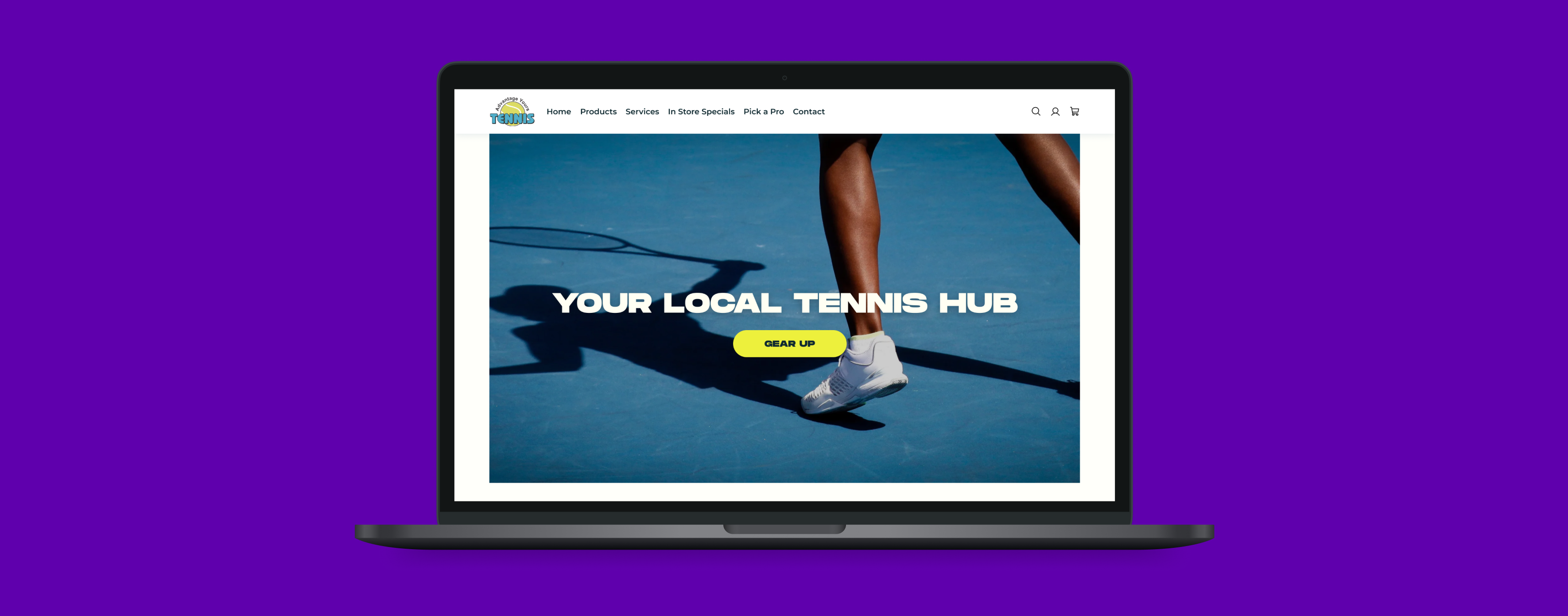
Tennis gear for everyone. A redesigned online store bringing a modern shopping experience to a small-town tennis shop, making it easier for the community to shop for what they need.
Project Overview
The goal of this project was to redesign a local tennis shop’s outdated e-commerce website to improve trust, navigation, and usability. Through user research and testing, we identified key pain points, such as unclear product information, a lack of credibility, and a confusing shopping flow. The redesign focuses on modernizing the interface, enhancing product discovery, and creating a seamless purchasing experience to better serve the community and drive engagement.
Design Approach
The redesign followed a structured UX design process to ensure a user-centered approach, improving trust, usability, and navigation. The framework consisted of four key phases:
Research
Extensive research was conducted, including user interviews, competitive analysis, and heuristic evaluations, to gather insights about user pain points, goals, and behaviors.
Synthesis
Insights were synthesized into clear problem statements, personas, and user journey maps to guide the design process and ensure alignment with user needs.
Design
Ideas were brainstormed and transformed into wireframes and prototypes, focusing on creating intuitive and accessible solutions to identified problems.
Delivery
The prototypes underwent usability testing in multiple rounds to gather feedback and refine the design, ensuring the final product was effective, seamless, and aligned with user expectations.
Scope of Work
- The Tennis Shop Redesign aims to enhance the online shopping experience by improving trust, navigation, and usability. However, challenges include outdated design, lack of detailed product information, and a confusing purchasing process.
- To address these challenges, the focus will be on modernizing the interface, streamlining product discovery, and building credibility to create a seamless shopping experience.
- This will be achieved through UX research, prototyping, and usability testing to ensure an intuitive and trustworthy e-commerce platform for customers.
Research & Synthesis
Goal of Research
The goal of this research is to identify key usability issues and barriers in the current tennis shop website that impact trust, navigation, and the overall shopping experience. By understanding user behaviors, pain points, and expectations, the research aims to inform a redesign that enhances credibility, product discovery, and ease of purchase, ultimately creating a more seamless and engaging e-commerce experience.
- Usability Testing + User Interviews Combined
- Competitive Research (Feature Inventory)
- Comparative Research (SWOT Analysis)
- Heuristic Evaluation
- Usability Testing Round 2
Methodology
Usability Testing + User Interviews Combined
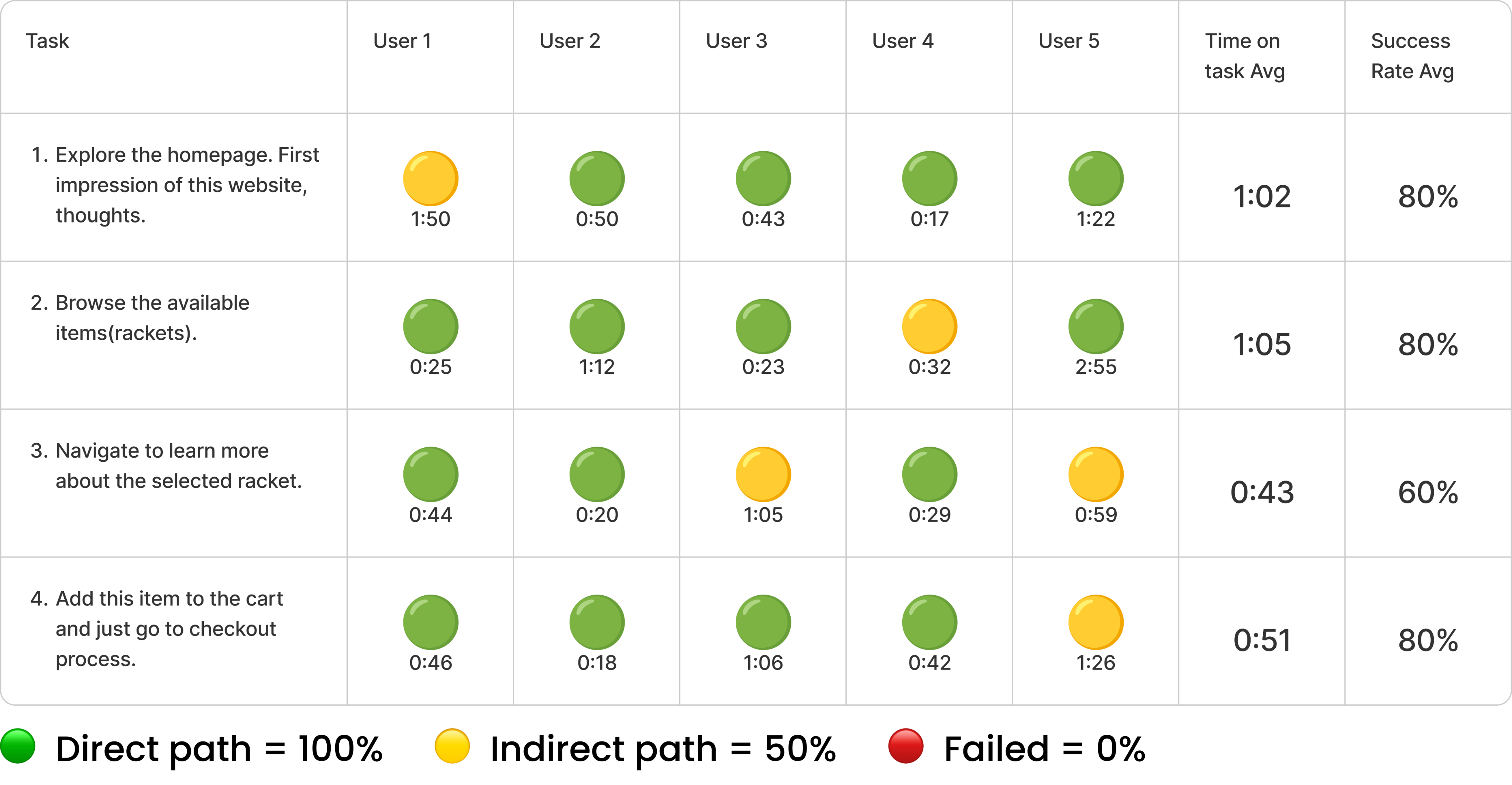
Usability testing and user interviews were combined to maximize efficiency in gathering valuable insights. While testing the existing website, I simultaneously conducted interviews to gather direct user feedback. This approach allowed me to address specific user needs and pain points more effectively, saving time, effort, and resources, while ensuring comprehensive data collection for informed design improvements.
Persona
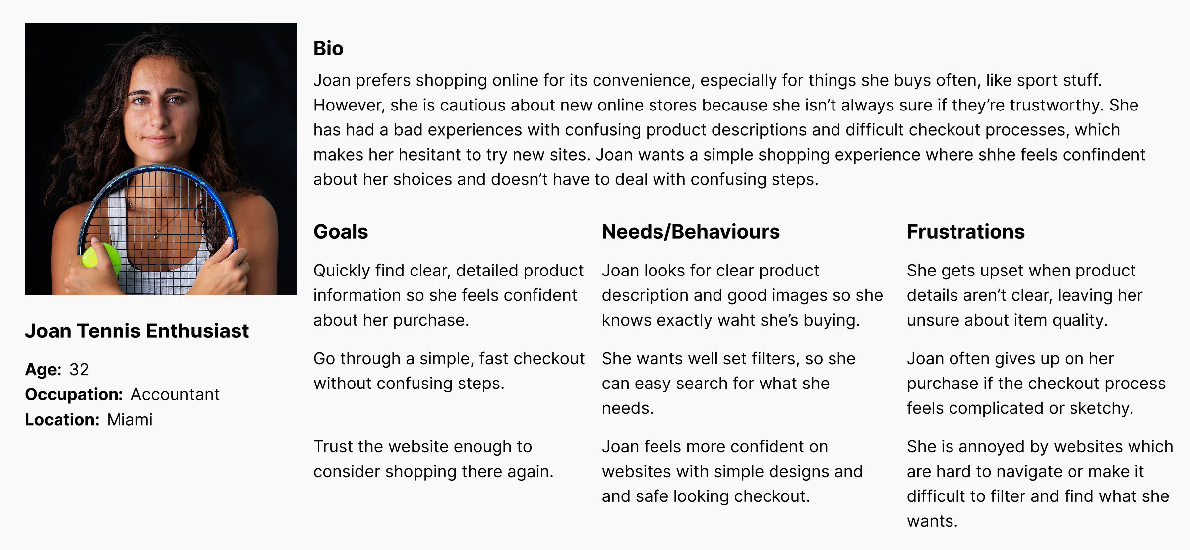
This persona is a result of insights gathered from user interviews, providing a detailed representation of the target audience. By analyzing the feedback and behaviors of real users, this persona helps to guide design decisions and ensures that the user’s needs, motivations, and challenges are effectively addressed throughout the project.
Heuristic Evaluation
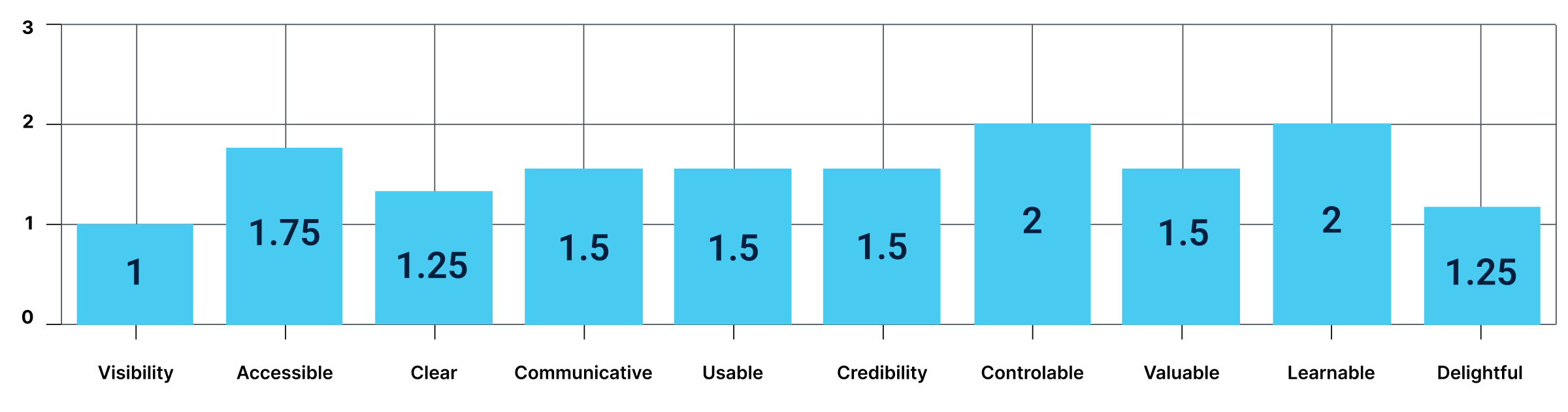
We took Abby Method of heuristic analysis which outlines a checklist of 10 heuristic principles; Findable, Accessible, Clear, Communicative, Useful, Credible, Controllable, Valuable, Learnable and Delightful.
Severity Rating
0 = Major Problem
1 = Medium Problem
2 = Minor Problem
3 = Major Meets Best Practices
Problem Statement
Website’s basic design and limited product description makes user feel uncertain about its credibility, reducing chances of completing a purchase.
How might we consider modernizing the online shopping experience for small businesses to increase trustworthiness, increase credibility, and increase sales on the business website.
C&C Analysis
Feature Inventory
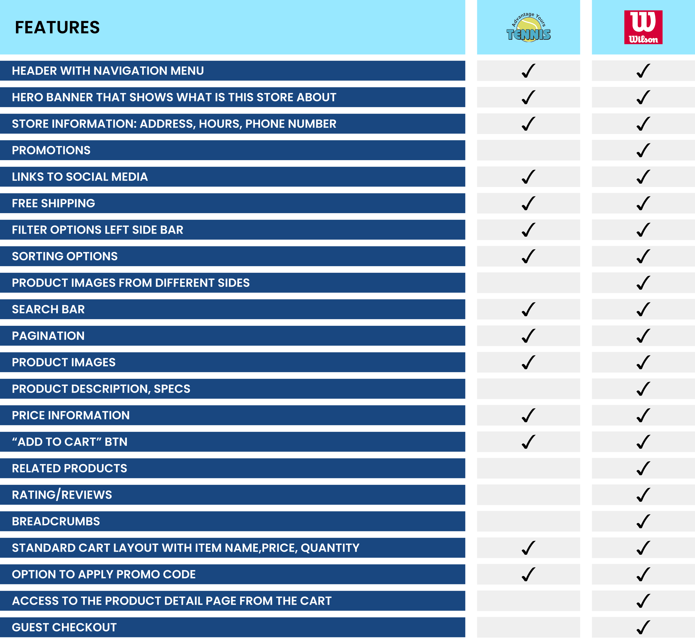
Navigation and Structure:
Top Navigation Bar and Footer are essential for seamless navigation and accessibility.
Core Features:
Dashboard: A critical feature for providing portfolio insights.
CTA Buttons: Ensure clear, actionable prompts for user engagement.
Hero Image and Landing Page: Strengthen first impressions and user flow.
Enhanced Usability:
Graphs/Charts: Vital for data visualization in decision-making.
Filter Options: Enable personalized content discovery.
Optional Elements:
Carousel: Rarely used but can enhance visual engagement.
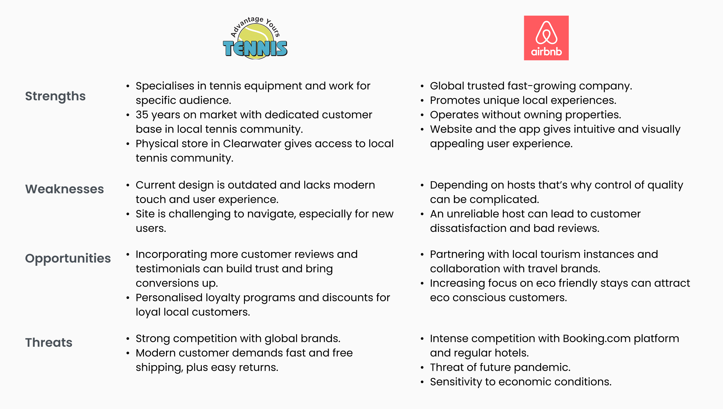
SWOT Analysis
- Get example from AirBnb’s community engagement. Add reviews and ratings.
- Focus on user experience and modern, easy and intuitive design.
- Personalised product recommendations, like AirBnb offers stays based on users preferences.
- Highlight customer reviews, and maybe return policy, showing transparency(like AirBnb).
Insights:
Research Takeaways
Research
Extensive research was conducted, including user interviews, competitive analysis, and heuristic evaluations, to gather insights about user pain points, goals, and behaviors.
Synthesis
Insights were synthesized into clear problem statements, personas, and user journey maps to guide the design process and ensure alignment with user needs.
Design
Ideas were brainstormed and transformed into wireframes and prototypes, focusing on creating intuitive and accessible solutions to identified problems.
Delivery
The prototypes underwent usability testing in multiple rounds to gather feedback and refine the design, ensuring the final product was effective, seamless, and aligned with user expectations.
Design & Deliver
Key Design Changes
Research
Extensive research was conducted, including user interviews, competitive analysis, and heuristic evaluations, to gather insights about user pain points, goals, and behaviors.
Synthesis
Insights were synthesized into clear problem statements, personas, and user journey maps to guide the design process and ensure alignment with user needs.
Design
Ideas were brainstormed and transformed into wireframes and prototypes, focusing on creating intuitive and accessible solutions to identified problems.
Delivery
The prototypes underwent usability testing in multiple rounds to gather feedback and refine the design, ensuring the final product was effective, seamless, and aligned with user expectations.
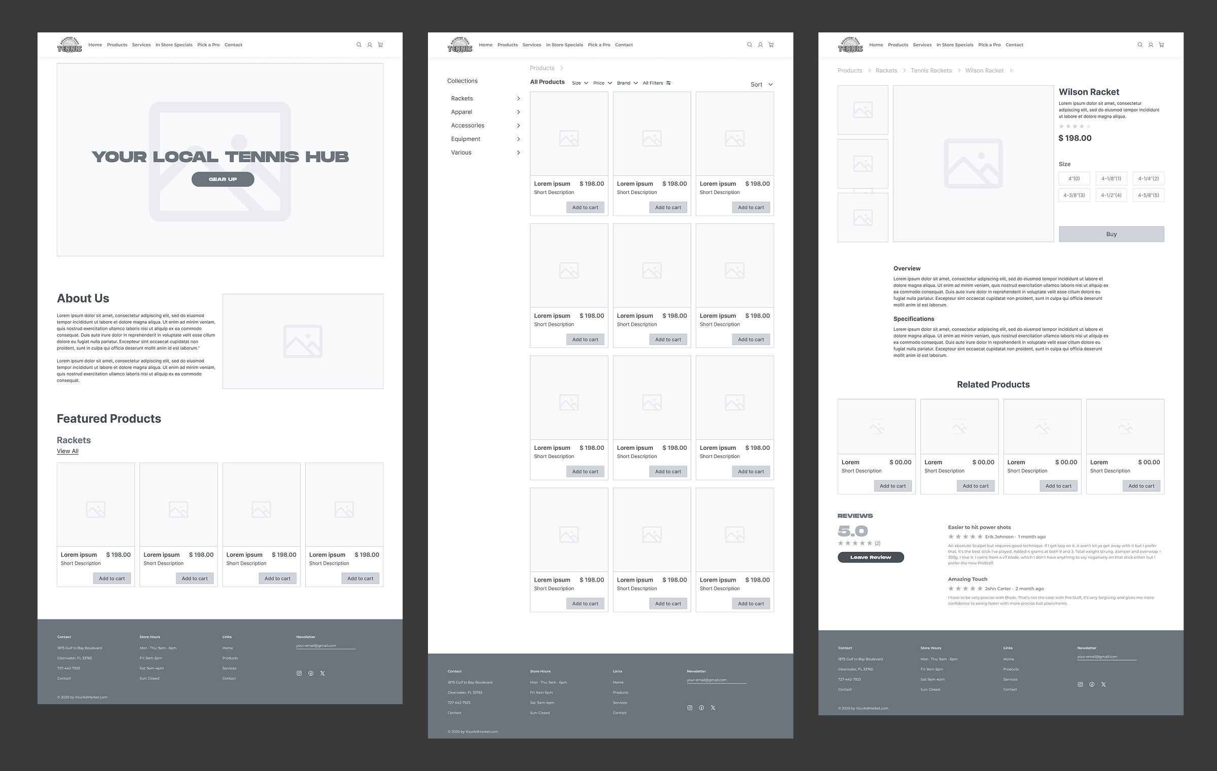
Mid-fidelity Screens
Building on the sketches, I developed mid-fidelity designs that refined the concepts and layout, bringing the ideas closer to a functional, polished user experience.
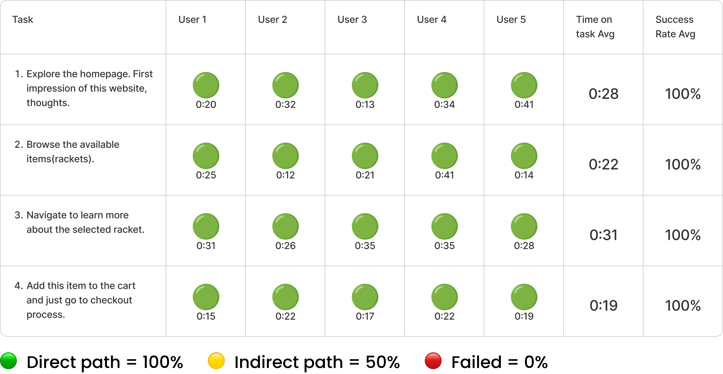
Usability Testing
We performed usability testing on the mid-fidelity screens to gather valuable feedback and ensure the designs were intuitive and met user needs effectively.
Hi-fidelity Screens
Following the usability testing on the mid-fidelity screens, I refined the design by incorporating colors and styles, bringing it to its final polished version.
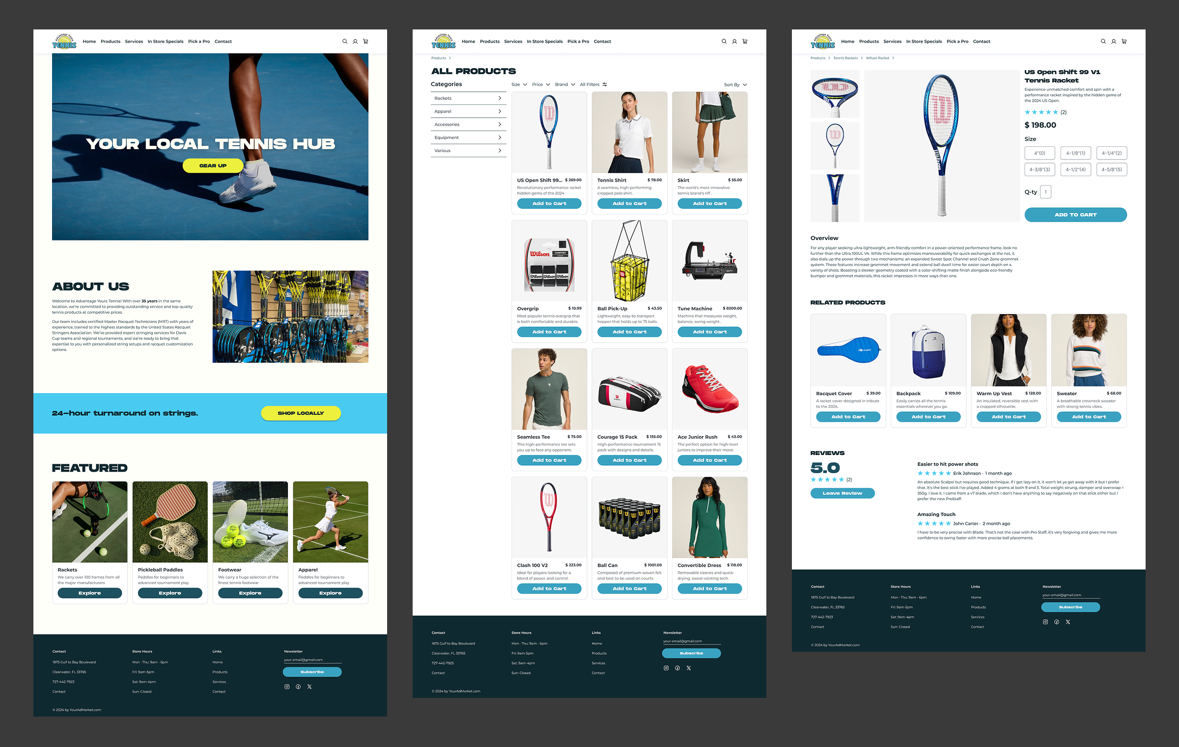
Prototype
Olha ‘Ola’ Lytovchenko
Home
About
Contact
Research / Design
Advance Your Tennis
Tennis gear for everyone. A redesigned online store bringing a modern shopping experience to a small-town tennis shop, making it easier for the community to shop for what they need.
Project Overview
The goal of this project was to redesign a local tennis shop’s outdated e-commerce website to improve trust, navigation, and usability. Through user research and testing, we identified key pain points, such as unclear product information, a lack of credibility, and a confusing shopping flow. The redesign focuses on modernizing the interface, enhancing product discovery, and creating a seamless purchasing experience to better serve the community and drive engagement.
Design Approach
The redesign followed a structured UX design process to ensure a user-centered approach, improving trust, usability, and navigation. The framework consisted of four key phases:
Research
Conducted usability testing, competitive analysis, and user interviews to identify pain points and opportunities.
Synthesis
Analyzed qualitative and quantitative data, creating affinity maps and personas to define user needs and priorities.
Design
Developed wireframes and prototypes, focusing on clear navigation, modern aesthetics, and enhanced product discovery.
Delivery
Conducted usability testing on the new design, iterating based on feedback to ensure a seamless and engaging shopping experience.
Scope of Work
- The Tennis Shop Redesign aims to enhance the online shopping experience by improving trust, navigation, and usability. However, challenges include outdated design, lack of detailed product information, and a confusing purchasing process.
- To address these challenges, the focus will be on modernizing the interface, streamlining product discovery, and building credibility to create a seamless shopping experience.
- This will be achieved through UX research, prototyping, and usability testing to ensure an intuitive and trustworthy e-commerce platform for customers.
Research & Synthesis
Goal of Research
The goal of this research is to identify key usability issues and barriers in the current tennis shop website that impact trust, navigation, and the overall shopping experience. By understanding user behaviors, pain points, and expectations, the research aims to inform a redesign that enhances credibility, product discovery, and ease of purchase, ultimately creating a more seamless and engaging e-commerce experience.
- Usability Testing + User Interviews Combined
- Competitive Research (Feature Inventory)
- Comparative Research (SWOT Analysis)
- Heuristic Evaluation
- Usability Testing Round 2
Methodology
Usability Testing + User Interviews Combined
Usability testing and user interviews were combined to maximize efficiency in gathering valuable insights. While testing the existing website, I simultaneously conducted interviews to gather direct user feedback. This approach allowed me to address specific user needs and pain points more effectively, saving time, effort, and resources, while ensuring comprehensive data collection for informed design improvements.
Persona
This persona is a result of insights gathered from user interviews, providing a detailed representation of the target audience. By analyzing the feedback and behaviors of real users, this persona helps to guide design decisions and ensures that the user’s needs, motivations, and challenges are effectively addressed throughout the project.
Heuristic Evaluation
We took Abby Method of heuristic analysis which outlines a checklist of 10 heuristic principles; Findable, Accessible, Clear, Communicative, Useful, Credible, Controllable, Valuable, Learnable and Delightful.
Severity Rating
0 = Major Problem
1 = Medium Problem
2 = Minor Problem
3 = Major Meets Best Practices
Problem Statement
Website’s basic design and limited product description makes user feel uncertain about its credibility, reducing chances of completing a purchase.
How might we consider modernizing the online shopping experience for small businesses to increase trustworthiness, increase credibility, and increase sales on the business website.
C&C Analysis
Feature Inventory
Navigation and Structure:
Top Navigation Bar and Footer are essential for seamless navigation and accessibility.
Core Features:
Dashboard: A critical feature for providing portfolio insights.
CTA Buttons: Ensure clear, actionable prompts for user engagement.
Hero Image and Landing Page: Strengthen first impressions and user flow.
Enhanced Usability:
Graphs/Charts: Vital for data visualization in decision-making.
Filter Options: Enable personalized content discovery.
Optional Elements:
Carousel: Rarely used but can enhance visual engagement.
SWOT Analysis
- Get example from AirBnb’s community engagement. Add reviews and ratings.
- Focus on user experience and modern, easy and intuitive design.
- Personalised product recommendations, like AirBnb offers stays based on users preferences.
- Highlight customer reviews, and maybe return policy, showing transparency(like AirBnb).
Insights:
Research Takeaways
Clean Visual Design
The outdated design elements and inconsistent visuals negatively affect the site's overall brand perception.
Accessibility
Issues with color contrast indicate accessibility gaps.
Navigation
The current navigation structure is cluttered, making it difficult for users to quickly find what they are looking for.
Product Details
Users may find it challenging to make purchase decisions due to lack of product details, such as comprehensive descriptions, specifications, or clear images.
Design & Deliver
Key Design Changes
Website Modernization
Applied a modern, cohesive design to all pages for a fresh, user-friendly experience.
Product Description Page
Added detailed descriptions, specifications, and product recommendations for a richer user experience.
Homepage Redesign
Updated the homepage to clearly communicate that the site is a tennis shop, with relevant imagery and messaging.
Cart & Payment Options
Integrated product recommendations in the cart .
Product Listing Page
Enhanced categorization for better product search and filtering, making it easier for users to find what they’re looking for.
Navigation
The current navigation structure is cluttered, making it difficult for users to quickly find what they are looking for.
Mid-fidelity Screens
Building on the sketches, I developed mid-fidelity designs that refined the concepts and layout, bringing the ideas closer to a functional, polished user experience.
Usability Testing
We performed usability testing on the mid-fidelity screens to gather valuable feedback and ensure the designs were intuitive and met user needs effectively.
Hi-fidelity Screens
Following the usability testing on the mid-fidelity screens, I refined the design by incorporating colors and styles, bringing it to its final polished version.
Prototype
Olha ‘Ola’ Lytovchenko
Home
About
Contact
Research / Design
Advance Your Tennis
Tennis gear for everyone. A redesigned online store bringing a modern shopping experience to a small-town tennis shop, making it easier for the community to shop for what they need.
Project Overview
The goal of this project was to redesign a local tennis shop’s outdated e-commerce website to improve trust, navigation, and usability. Through user research and testing, we identified key pain points, such as unclear product information, a lack of credibility, and a confusing shopping flow. The redesign focuses on modernizing the interface, enhancing product discovery, and creating a seamless purchasing experience to better serve the community and drive engagement.
Scope of Work
- The Tennis Shop Redesign aims to enhance the online shopping experience by improving trust, navigation, and usability. However, challenges include outdated design, lack of detailed product information, and a confusing purchasing process.
- To address these challenges, the focus will be on modernizing the interface, streamlining product discovery, and building credibility to create a seamless shopping experience.
- This will be achieved through UX research, prototyping, and usability testing to ensure an intuitive and trustworthy e-commerce platform for customers.
Design Approach
The redesign followed a structured UX design process to ensure a user-centered approach, improving trust, usability, and navigation. The framework consisted of four key phases:
Research
Conducted usability testing, competitive analysis, and user interviews to identify pain points and opportunities.
Synthesis
Analyzed qualitative and quantitative data, creating affinity maps and personas to define user needs and priorities.
Design
Developed wireframes and prototypes, focusing on clear navigation, modern aesthetics, and enhanced product discovery.
Delivery
Conducted usability testing on the new design, iterating based on feedback to ensure a seamless and engaging shopping experience.
Research & Synthesis
Goal of Research
The goal of this research is to identify key usability issues and barriers in the current tennis shop website that impact trust, navigation, and the overall shopping experience. By understanding user behaviors, pain points, and expectations, the research aims to inform a redesign that enhances credibility, product discovery, and ease of purchase, ultimately creating a more seamless and engaging e-commerce experience.
Methodology
- Usability Testing + User Interviews Combined
- Competitive Research (Feature Inventory)
- Comparative Research (SWOT Analysis)
- Heuristic Evaluation
- Usability Testing Round 2
Usability Testing + User Interviews Combined
Usability testing and user interviews were combined to maximize efficiency in gathering valuable insights. While testing the existing website, I simultaneously conducted interviews to gather direct user feedback. This approach allowed me to address specific user needs and pain points more effectively, saving time, effort, and resources, while ensuring comprehensive data collection for informed design improvements.
Persona
This persona is a result of insights gathered from user interviews, providing a detailed representation of the target audience. By analyzing the feedback and behaviors of real users, this persona helps to guide design decisions and ensures that the user’s needs, motivations, and challenges are effectively addressed throughout the project.
Problem Statement
Website’s basic design and limited product description makes user feel uncertain about its credibility, reducing chances of completing a purchase.
How might we consider modernizing the online shopping experience for small businesses to increase trustworthiness, increase credibility, and increase sales on the business website.
Heuristic Evaluation
We took Abby Method of heuristic analysis which outlines a checklist of 10 heuristic principles; Findable, Accessible, Clear, Communicative, Useful, Credible, Controllable, Valuable, Learnable and Delightful.
Severity Rating
0 = Major Problem
1 = Medium Problem
2 = Minor Problem
3 = Major Meets Best Practices
C&C Analysis
Feature Inventory
Navigation and Structure:
Top Navigation Bar and Footer are essential for seamless navigation and accessibility.
Core Features:
Dashboard: A critical feature for providing portfolio insights.
CTA Buttons: Ensure clear, actionable prompts for user engagement.
Hero Image and Landing Page: Strengthen first impressions and user flow.
Enhanced Usability:
Graphs/Charts: Vital for data visualization in decision-making.
Filter Options: Enable personalized content discovery.
Optional Elements:
Carousel: Rarely used but can enhance visual engagement.
SWOT Analysis
Insights:
- Get example from AirBnb’s community engagement. Add reviews and ratings.
- Focus on user experience and modern, easy and intuitive design.
- Personalised product recommendations, like AirBnb offers stays based on users preferences.
- Highlight customer reviews, and maybe return policy, showing transparency(like AirBnb).
Research Takeaways
Clean Visual Design
The outdated design elements and inconsistent visuals negatively affect the site's overall brand perception.
Accessibility
Issues with color contrast indicate accessibility gaps.
Navigation
The current navigation structure is cluttered, making it difficult for users to quickly find what they are looking for.
Product Details
Users may find it challenging to make purchase decisions due to lack of product details, such as comprehensive descriptions, specifications, or clear images.
Design & Deliver
Key Design Changes
Website Modernization
Applied a modern, cohesive design to all pages for a fresh, user-friendly experience.
Product Description Page
Added detailed descriptions, specifications, and product recommendations for a richer user experience.
Homepage Redesign
Updated the homepage to clearly communicate that the site is a tennis shop, with relevant imagery and messaging.
Cart & Payment Options
Integrated product recommendations in the cart .
Product Listing Page
Enhanced categorization for better product search and filtering, making it easier for users to find what they’re looking for.
Navigation
The current navigation structure is cluttered, making it difficult for users to quickly find what they are looking for.
Mid-fidelity Screens
Building on the sketches, I developed mid-fidelity designs that refined the concepts and layout, bringing the ideas closer to a functional, polished user experience.
Usability Testing
We performed usability testing on the mid-fidelity screens to gather valuable feedback and ensure the designs were intuitive and met user needs effectively.
Hi-fidelity Screens
Following the usability testing on the mid-fidelity screens, I refined the design by incorporating colors and styles, bringing it to its final polished version.
Prototype