Olha ‘Ola’ Lytovchenko

Home
About
Contact
Research / Design
Lighthouse
Quant investing for everyone. A hedge-fund grade investment platform designed to make sophisticated strategies simple, accessible, and automated for everyday investors.
Project Overview
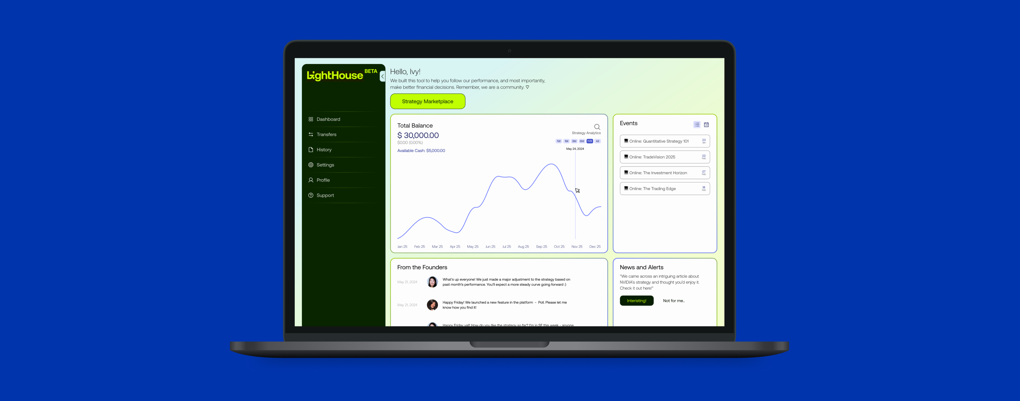
LightHouse is an investment marketplace specialized in quantitative strategies. LightHouse is built to let people invest confidently and have more time to focus on what truly matters in their life, secure in the knowledge that their investments are being managed efficiently and intelligently.
The special aspect of LightHouse is that its core offerings are quantitative strategies. The team aims to democratize the financial market by bringing what’s been exclusive to the high-net-worth, hedge fund grade funds, to the mass market.
Scope of Work
- The Lighthouse MVP aims to make quantitative trading accessible to everyone but struggles with usability, accessibility, and building trust among users with limited financial knowledge.
- Addressing these challenges by enhancing clarity, engagement, and confidence is key to ensuring a successful launch and adoption.
- To enhance the performance, usability, and accessibility of our early MVP product by employing UX research methods.
Design Approach
A user-centered approach was applied to ensure the design process focused on understanding and addressing the needs of the target users. The process was divided into four key stages
Research
Extensive research was conducted, including user interviews, competitive analysis, and heuristic evaluations, to gather insights about user pain points, goals, and behaviors.
Synthesis
Insights were synthesized into clear problem statements, personas, and user journey maps to guide the design process and ensure alignment with user needs.
Design
Ideas were brainstormed and transformed into wireframes and prototypes, focusing on creating intuitive and accessible solutions to identified problems.
Delivery
The prototypes underwent usability testing in multiple rounds to gather feedback and refine the design, ensuring the final product was effective, seamless, and aligned with user expectations.
Focus Area
The Lighthouse MVP aims to democratize quantitative trading but faces usability challenges in information architecture, accessibility, and trust-building. Enhancing clarity, engagement, and user confidence is critical for a successful launch and adoption.
How might we simplify the investing process providing Ivy with clear insights that empower her to reach her financial milestones?
Research & Synthesis
Goal of Research
To understand the target users' needs, pain points, and behaviours, identify key problems to solve, and validate the effectiveness of design solutions to create a user-cantered platform that meets business objectives and delivers a seamless investment experience.
Methods
- Screener Survey
- User Interviews
- C&C Analysis (Feature Inventory)
- C&C Analysis (Element Analysis)
- Heuristic Evaluation
- Usability Testing
Six research methods were used in the discovery phase but highlight the three most impactful ones, which deeply informed user needs, pain points, and key design decisions to align solutions with target audience expectations.
Heuristic Evaluation
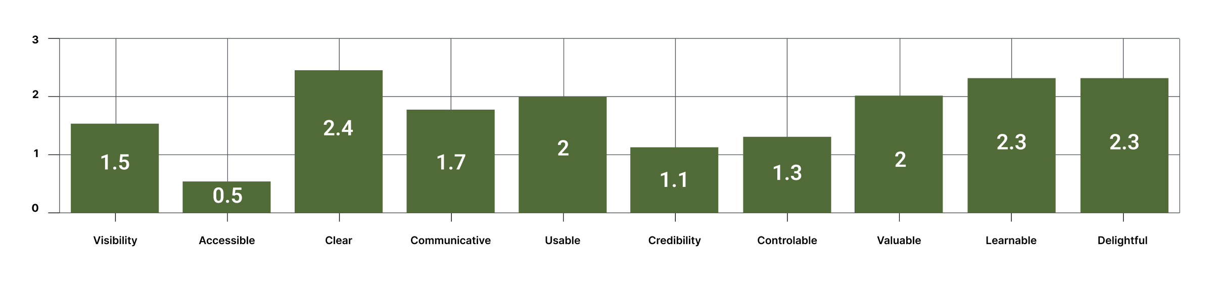
We took Abby Method of heuristic analysis which outlines a checklist of 10 heuristic principles; Findable, Accessible, Clear, Communicative, Useful, Credible, Controllable, Valuable, Learnable and Delightful.
Severity Rating
0 = Major Problem
1 = Medium Problem
2 = Minor Problem
3 = Major Meets Best Practices
C&C Analysis
Feature Inventory
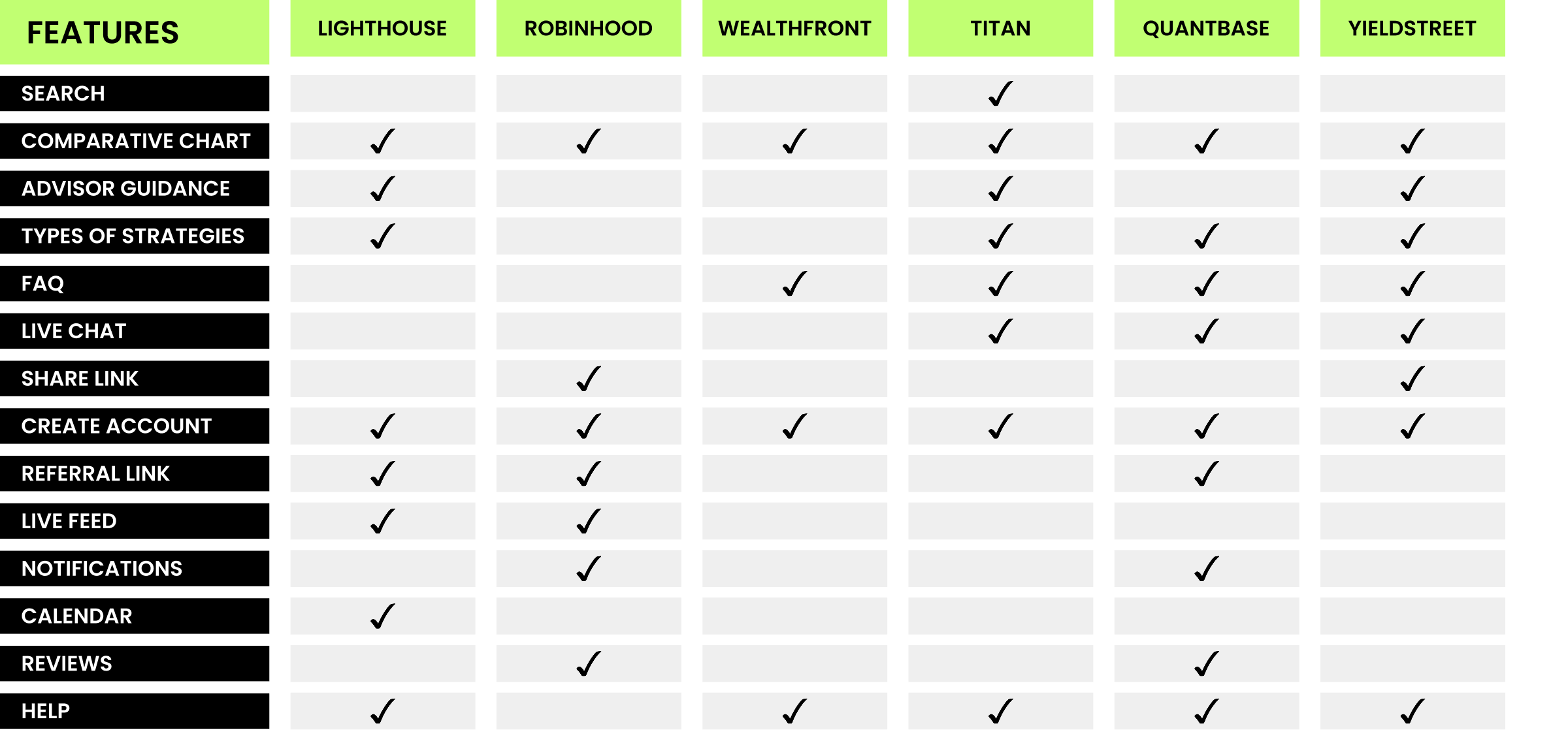
Navigation and Structure:
Top Navigation Bar and Footer are essential for seamless navigation and accessibility.
Core Features:
Dashboard: A critical feature for providing portfolio insights.
CTA Buttons: Ensure clear, actionable prompts for user engagement.
Hero Image and Landing Page: Strengthen first impressions and user flow.
Enhanced Usability:
Drop-Down Menus and Hyperlinks streamline navigation and content access.
Graphs/Charts: Vital for data visualization in decision-making.
Filter Options: Enable personalized content discovery.
Optional Elements:
Carousel: Rarely used but can enhance visual engagement.
Element Analysis
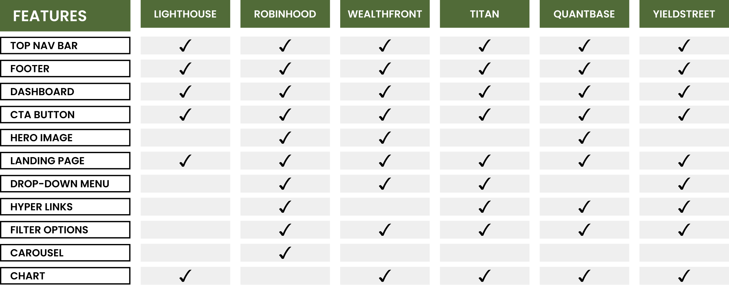
Strengths:
- Unique features like Advisor Guidance and Types of Strategies highlight a focus on personalized, strategic investment support.
- Live Feed, Referral Links, and Create Account streamline onboarding and user engagement.
Improvement Opportunities:
- Add Search, Comparative Charts, and Live Chat to enhance navigation, insights, and customer support.
- Introduce FAQ and Help Sections for better self-service support.
Engagement and Credibility:
- Implement Notifications and Calendar Tools to boost user engagement.
- Include Reviews and Share Links to build trust and expand visibility.
User Interviews
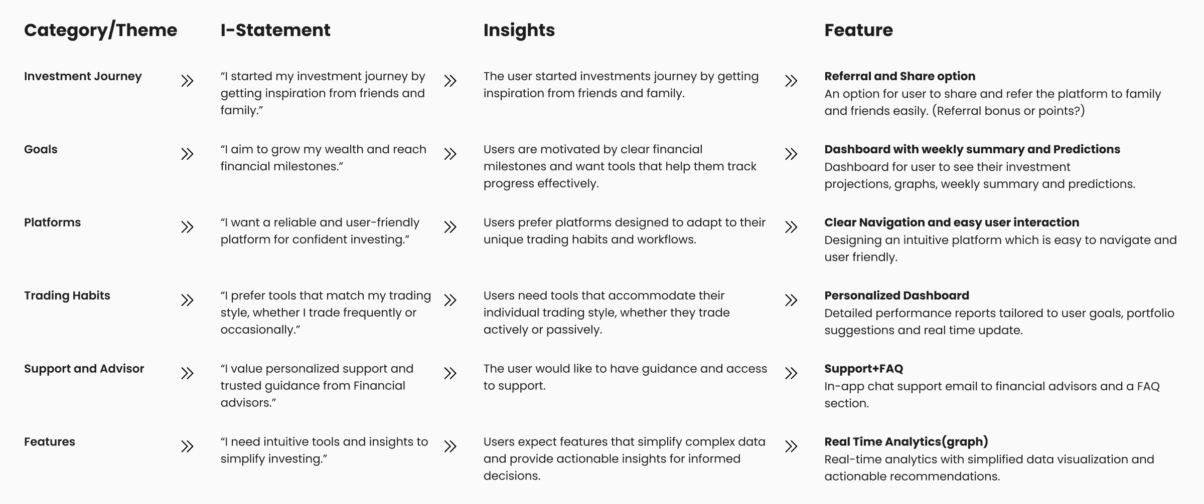
We conducted user interviews with 5 participants to gather qualitative data on their needs, goals, and frustrations. Using affinity mapping, we categorized the responses and developed “I-Statements” to identify key user insights. These insights informed the features listed.
Persona
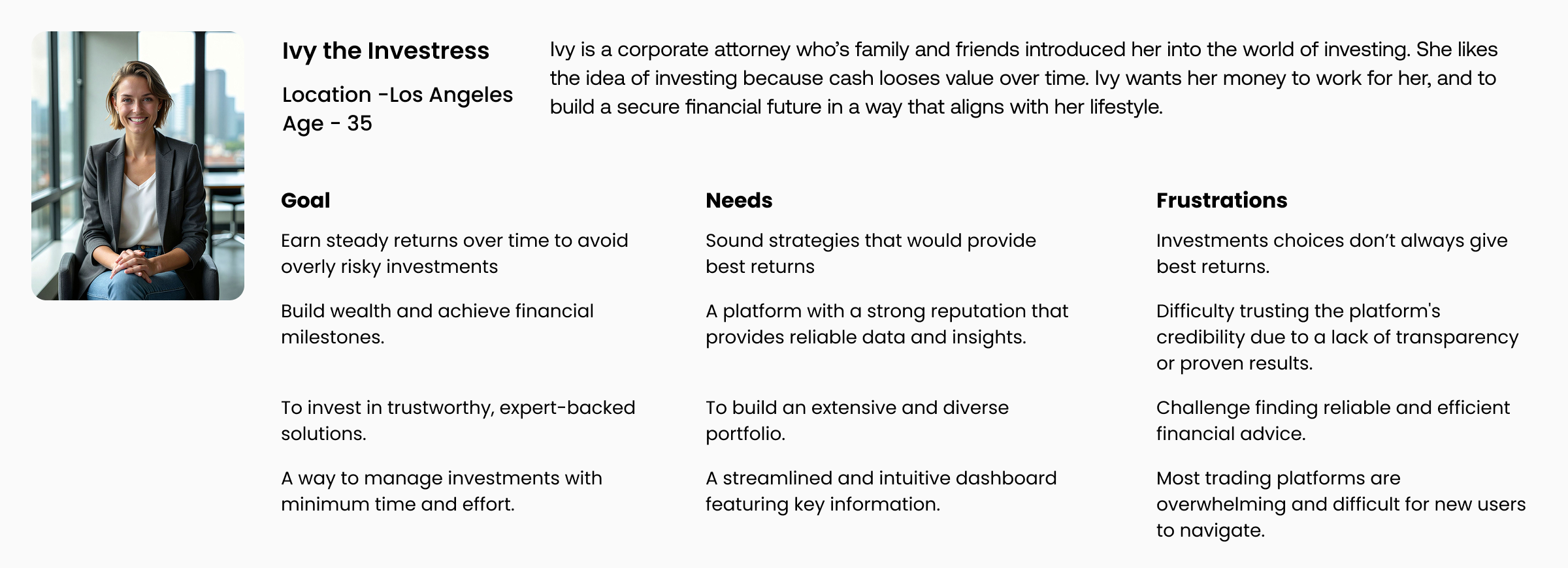
Based on the findings from user interviews and the proto-persona provided by the client, we developed the following persona. It reflects the key motivations, behaviors, goals, and frustrations of our target users, serving as a foundation for designing user-centered solutions.
Journey Map
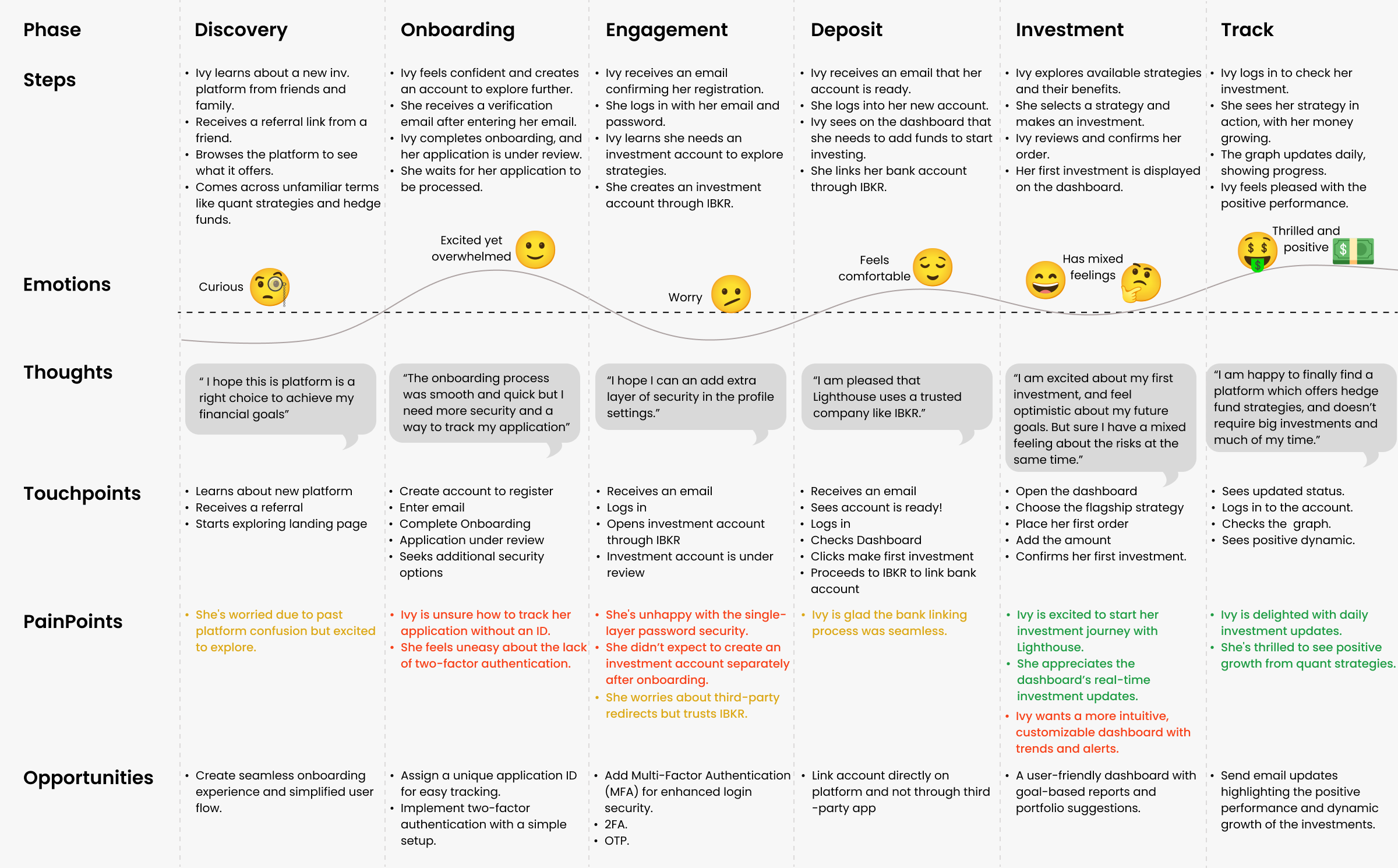
The journey map shows a day in the life of our target audience, highlighting their experiences, emotions, and interactions with the platform. It outlines their goals, challenges, and areas for improvement, helping us identify where the platform can better meet their needs.
Design & Delivery
Design Studio: Sketching + Concepting
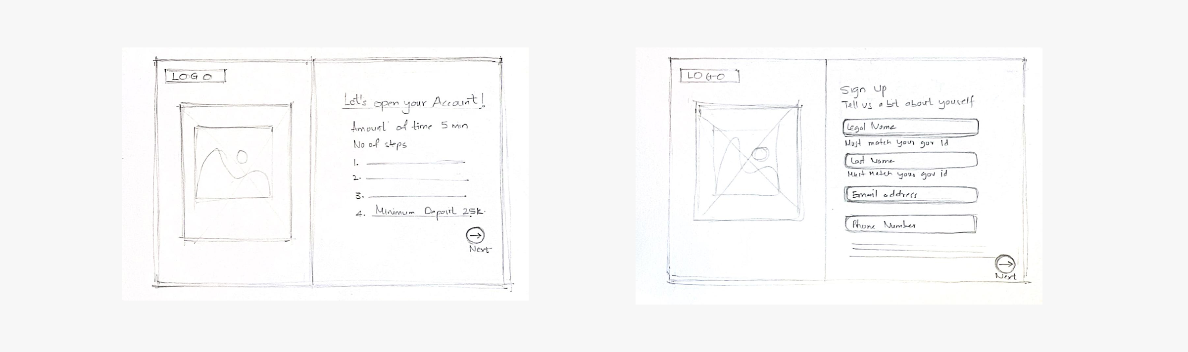
During the design studio phase, we focused on sketching and concepting various solutions to address the core user pain points identified in our research. This collaborative process involved generating multiple ideas, exploring different layouts, and experimenting with visual elements to find the most effective way to deliver an intuitive, user-friendly experience.
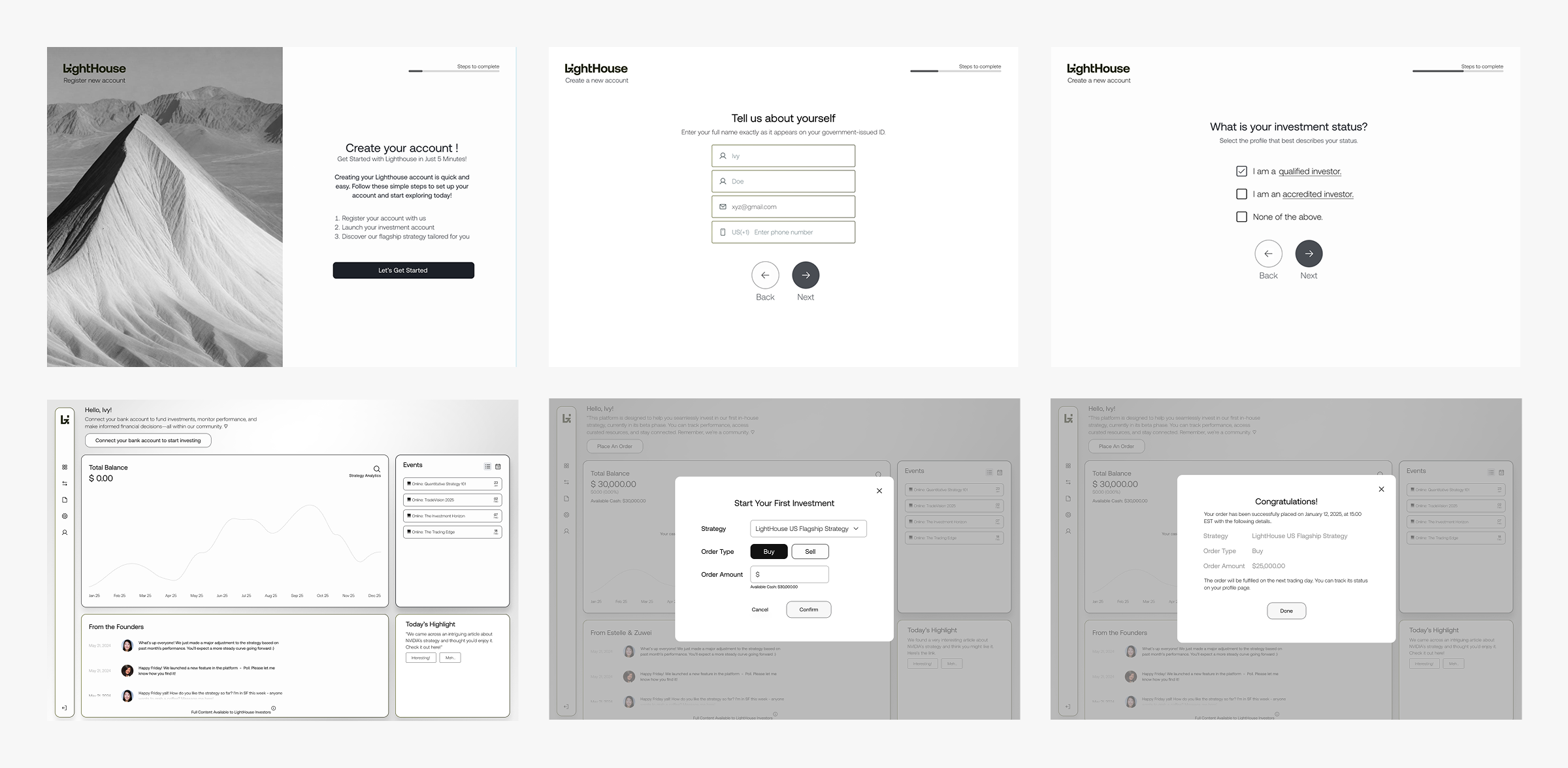
Mid-fidelity Screens
The wireframing phase involved translating our initial concepts into more refined, low-fidelity designs. As we iterated, we continuously evolved the concepts based on feedback and testing, focusing on optimizing the user flow and interface elements. Each version of the wireframe represented a step closer to simplifying the user experience, ensuring that features were logically placed and easy to interact with.
Usability Testing (Mid-fi)
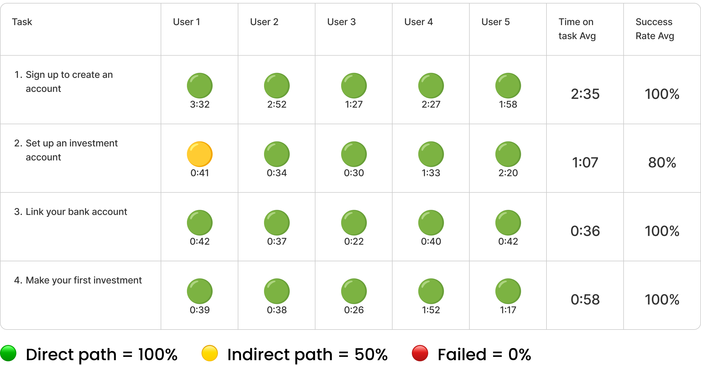
Assessed all 4 flows with newly developed mid-fidelity designs to validate reimagined user journeys, ensuring functionality and alignment with user expectations.
Key Takeaways
- Sign-Up: 100% success; improve efficiency to reduce time variability.
- Set Up Investment Account: 80% success; add clearer guidance to avoid indirect paths.
- Link Bank Account & Make Investment: 100% success; processes are smooth and intuitive—no changes needed.
Hi-fidelity Screens
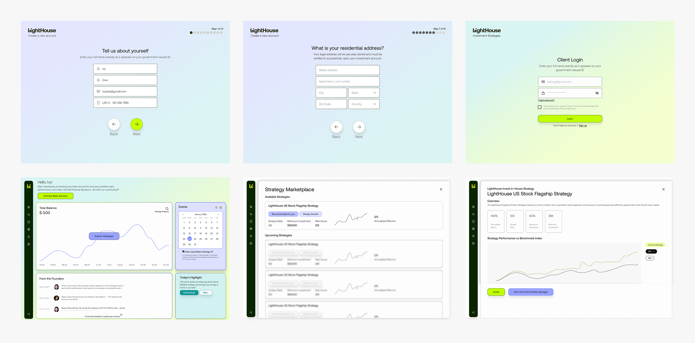
The high-fidelity phase transformed refined wireframes into polished designs, incorporating feedback to optimize usability and visual appeal. Each iteration focused on enhancing the user flow, interface clarity, and intuitive interactions.
Prototype
Olha ‘Ola’ Lytovchenko
Home
About
Contact
Research / Design
Lighthouse
Quant investing for everyone. A hedge-fund grade investment platform designed to make sophisticated strategies simple, accessible, and automated for everyday investors.
Project Overview
LightHouse is an investment marketplace specialized in quantitative strategies. LightHouse is built to let people invest confidently and have more time to focus on what truly matters in their life, secure in the knowledge that their investments are being managed efficiently and intelligently.
The special aspect of LightHouse is that its core offerings are quantitative strategies. The team aims to democratize the financial market by bringing what’s been exclusive to the high-net-worth, hedge fund grade funds, to the mass market.
Scope of Work
- The Lighthouse MVP aims to make quantitative trading accessible to everyone but struggles with usability, accessibility, and building trust among users with limited financial knowledge.
- Addressing these challenges by enhancing clarity, engagement, and confidence is key to ensuring a successful launch and adoption.
- To enhance the performance, usability, and accessibility of our early MVP product by employing UX research methods.
Design Approach
A user-centered approach was applied to ensure the design process focused on understanding and addressing the needs of the target users. The process was divided into four key stages
Research
Extensive research was conducted, including user interviews, competitive analysis, and heuristic evaluations, to gather insights about user pain points, goals, and behaviors.
Synthesis
Insights were synthesized into clear problem statements, personas, and user journey maps to guide the design process and ensure alignment with user needs.
Design
Ideas were brainstormed and transformed into wireframes and prototypes, focusing on creating intuitive and accessible solutions to identified problems.
Delivery
The prototypes underwent usability testing in multiple rounds to gather feedback and refine the design, ensuring the final product was effective, seamless, and aligned with user expectations.
Focus Area
The Lighthouse MVP aims to democratize quantitative trading but faces usability challenges in information architecture, accessibility, and trust-building. Enhancing clarity, engagement, and user confidence is critical for a successful launch and adoption.
How might we simplify the investing process providing Ivy with clear insights that empower her to reach her financial milestones?
Research & Synthesis
Goal of Research
To understand the target users' needs, pain points, and behaviours, identify key problems to solve, and validate the effectiveness of design solutions to create a user-cantered platform that meets business objectives and delivers a seamless investment experience.
Methods
- Screener Survey
- User Interviews
- C&C Analysis (Feature Inventory)
- C&C Analysis (Element Analysis)
- Heuristic Evaluation
- Usability Testing
Six research methods were used in the discovery phase but highlight the three most impactful ones, which deeply informed user needs, pain points, and key design decisions to align solutions with target audience expectations.
Heuristic Evaluation
We took Abby Method of heuristic analysis which outlines a checklist of 10 heuristic principles; Findable, Accessible, Clear, Communicative, Useful, Credible, Controllable, Valuable, Learnable and Delightful.
Severity Rating
0 = Major Problem
1 = Medium Problem
2 = Minor Problem
3 = Major Meets Best Practices
C&C Analysis
Feature Inventory
Navigation and Structure:
Top Navigation Bar and Footer are essential for seamless navigation and accessibility.
Core Features:
Dashboard: A critical feature for providing portfolio insights.
CTA Buttons: Ensure clear, actionable prompts for user engagement.
Hero Image and Landing Page: Strengthen first impressions and user flow.
Enhanced Usability:
Drop-Down Menus and Hyperlinks streamline navigation and content access.
Graphs/Charts: Vital for data visualization in decision-making.
Filter Options: Enable personalized content discovery.
Optional Elements:
Carousel: Rarely used but can enhance visual engagement.
Element Analysis
Strengths:
- Unique features like Advisor Guidance and Types of Strategies highlight a focus on personalized, strategic investment support.
- Live Feed, Referral Links, and Create Account streamline onboarding and user engagement.
Improvement Opportunities:
- Add Search, Comparative Charts, and Live Chat to enhance navigation, insights, and customer support.
- Introduce FAQ and Help Sections for better self-service support.
Engagement and Credibility:
- Implement Notifications and Calendar Tools to boost user engagement.
- Include Reviews and Share Links to build trust and expand visibility.
User Interviews
We conducted user interviews with 5 participants to gather qualitative data on their needs, goals, and frustrations. Using affinity mapping, we categorized the responses and developed “I-Statements” to identify key user insights. These insights informed the features listed.
Persona
Based on the findings from user interviews and the proto-persona provided by the client, we developed the following persona. It reflects the key motivations, behaviors, goals, and frustrations of our target users, serving as a foundation for designing user-centered solutions.
Journey Map
The journey map shows a day in the life of our target audience, highlighting their experiences, emotions, and interactions with the platform. It outlines their goals, challenges, and areas for improvement, helping us identify where the platform can better meet their needs.
Design & Delivery
Design Studio: Sketching + Concepting
During the design studio phase, we focused on sketching and concepting various solutions to address the core user pain points identified in our research. This collaborative process involved generating multiple ideas, exploring different layouts, and experimenting with visual elements to find the most effective way to deliver an intuitive, user-friendly experience.
Mid-fidelity Screens
The wireframing phase involved translating our initial concepts into more refined, low-fidelity designs. As we iterated, we continuously evolved the concepts based on feedback and testing, focusing on optimizing the user flow and interface elements. Each version of the wireframe represented a step closer to simplifying the user experience, ensuring that features were logically placed and easy to interact with.
Usability Testing (Mid-fi)
Assessed all 4 flows with newly developed mid-fidelity designs to validate reimagined user journeys, ensuring functionality and alignment with user expectations.
Key Takeaways
- Sign-Up: 100% success; improve efficiency to reduce time variability.
- Set Up Investment Account: 80% success; add clearer guidance to avoid indirect paths.
- Link Bank Account & Make Investment: 100% success; processes are smooth and intuitive—no changes needed.
Hi-fidelity Screens
The high-fidelity phase transformed refined wireframes into polished designs, incorporating feedback to optimize usability and visual appeal. Each iteration focused on enhancing the user flow, interface clarity, and intuitive interactions.
Prototype
Olha ‘Ola’ Lytovchenko
Home
About
Contact
Research / Design
Lighthouse
Quant investing for everyone. A hedge-fund grade investment platform designed to make sophisticated strategies simple, accessible, and automated for everyday investors.
Project Overview
LightHouse is an investment marketplace specialized in quantitative strategies. LightHouse is built to let people invest confidently and have more time to focus on what truly matters in their life, secure in the knowledge that their investments are being managed efficiently and intelligently.
The special aspect of LightHouse is that its core offerings are quantitative strategies. The team aims to democratize the financial market by bringing what’s been exclusive to the high-net-worth, hedge fund grade funds, to the mass market.
Scope of Work
- The Lighthouse MVP aims to make quantitative trading accessible to everyone but struggles with usability, accessibility, and building trust among users with limited financial knowledge.
- Addressing these challenges by enhancing clarity, engagement, and confidence is key to ensuring a successful launch and adoption.
- To enhance the performance, usability, and accessibility of our early MVP product by employing UX research methods.
Design Approach
A user-centered approach was applied to ensure the design process focused on understanding and addressing the needs of the target users. The process was divided into four key stages
Research
Extensive research was conducted, including user interviews, competitive analysis, and heuristic evaluations, to gather insights about user pain points, goals, and behaviors.
Synthesis
Insights were synthesized into clear problem statements, personas, and user journey maps to guide the design process and ensure alignment with user needs.
Design
Ideas were brainstormed and transformed into wireframes and prototypes, focusing on creating intuitive and accessible solutions to identified problems.
Delivery
The prototypes underwent usability testing in multiple rounds to gather feedback and refine the design, ensuring the final product was effective, seamless, and aligned with user expectations.
Focus Area
The Lighthouse MVP aims to democratize quantitative trading but faces usability challenges in information architecture, accessibility, and trust-building. Enhancing clarity, engagement, and user confidence is critical for a successful launch and adoption.
How might we simplify the investing process providing Ivy with clear insights that empower her to reach her financial milestones?
Research & Synthesis
Goal of Research
To understand the target users' needs, pain points, and behaviours, identify key problems to solve, and validate the effectiveness of design solutions to create a user-cantered platform that meets business objectives and delivers a seamless investment experience.
Methods
- Screener Survey
- User Interviews
- C&C Analysis (Feature Inventory)
- C&C Analysis (Element Analysis)
- Heuristic Evaluation
- Usability Testing
Six research methods were used in the discovery phase but highlight the three most impactful ones, which deeply informed user needs, pain points, and key design decisions to align solutions with target audience expectations.
Heuristic Evaluation
We took Abby Method of heuristic analysis which outlines a checklist of 10 heuristic principles; Findable, Accessible, Clear, Communicative, Useful, Credible, Controllable, Valuable, Learnable and Delightful.
Severity Rating
0 = Major Problem
1 = Medium Problem
2 = Minor Problem
3 = Major Meets Best Practices
C&C Analysis
Feature Inventory
Navigation and Structure:
Top Navigation Bar and Footer are essential for seamless navigation and accessibility.
Core Features:
Dashboard: A critical feature for providing portfolio insights.
CTA Buttons: Ensure clear, actionable prompts for user engagement.
Hero Image and Landing Page: Strengthen first impressions and user flow.
Enhanced Usability:
Drop-Down Menus and Hyperlinks streamline navigation and content access.
Graphs/Charts: Vital for data visualization in decision-making.
Filter Options: Enable personalized content discovery.
Optional Elements:
Carousel: Rarely used but can enhance visual engagement.
Element Analysis
Strengths:
- Unique features like Advisor Guidance and Types of Strategies highlight a focus on personalized, strategic investment support.
- Live Feed, Referral Links, and Create Account streamline onboarding and user engagement.
Improvement Opportunities:
- Add Search, Comparative Charts, and Live Chat to enhance navigation, insights, and customer support.
- Introduce FAQ and Help Sections for better self-service support.
Engagement and Credibility:
- Implement Notifications and Calendar Tools to boost user engagement.
- Include Reviews and Share Links to build trust and expand visibility.
User Interviews
We conducted user interviews with 5 participants to gather qualitative data on their needs, goals, and frustrations. Using affinity mapping, we categorized the responses and developed “I-Statements” to identify key user insights. These insights informed the features listed.
Persona
Based on the findings from user interviews and the proto-persona provided by the client, we developed the following persona. It reflects the key motivations, behaviors, goals, and frustrations of our target users, serving as a foundation for designing user-centered solutions.
Journey Map
The journey map shows a day in the life of our target audience, highlighting their experiences, emotions, and interactions with the platform. It outlines their goals, challenges, and areas for improvement, helping us identify where the platform can better meet their needs.
Design & Delivery
Design Studio: Sketching + Concepting
During the design studio phase, we focused on sketching and concepting various solutions to address the core user pain points identified in our research. This collaborative process involved generating multiple ideas, exploring different layouts, and experimenting with visual elements to find the most effective way to deliver an intuitive, user-friendly experience.
Mid-fidelity Screens
The wireframing phase involved translating our initial concepts into more refined, low-fidelity designs. As we iterated, we continuously evolved the concepts based on feedback and testing, focusing on optimizing the user flow and interface elements. Each version of the wireframe represented a step closer to simplifying the user experience, ensuring that features were logically placed and easy to interact with.
Usability Testing (Mid-fi)
Assessed all 4 flows with newly developed mid-fidelity designs to validate reimagined user journeys, ensuring functionality and alignment with user expectations.
Key Takeaways
- Sign-Up: 100% success; improve efficiency to reduce time variability.
- Set Up Investment Account: 80% success; add clearer guidance to avoid indirect paths.
- Link Bank Account & Make Investment: 100% success; processes are smooth and intuitive—no changes needed.
Hi-fidelity Screens
The high-fidelity phase transformed refined wireframes into polished designs, incorporating feedback to optimize usability and visual appeal. Each iteration focused on enhancing the user flow, interface clarity, and intuitive interactions.
Prototype